


Vitanet
Some of the conclusions in this piece are our retrospective interpretation of the process. We can’t say with certainty what ultimately caused the project to stop, so we’re deliberately separating the facts of what happened during the work from the assumptions we made afterward.



Sometimes the most interesting projects end not with a launch, but with a pause.
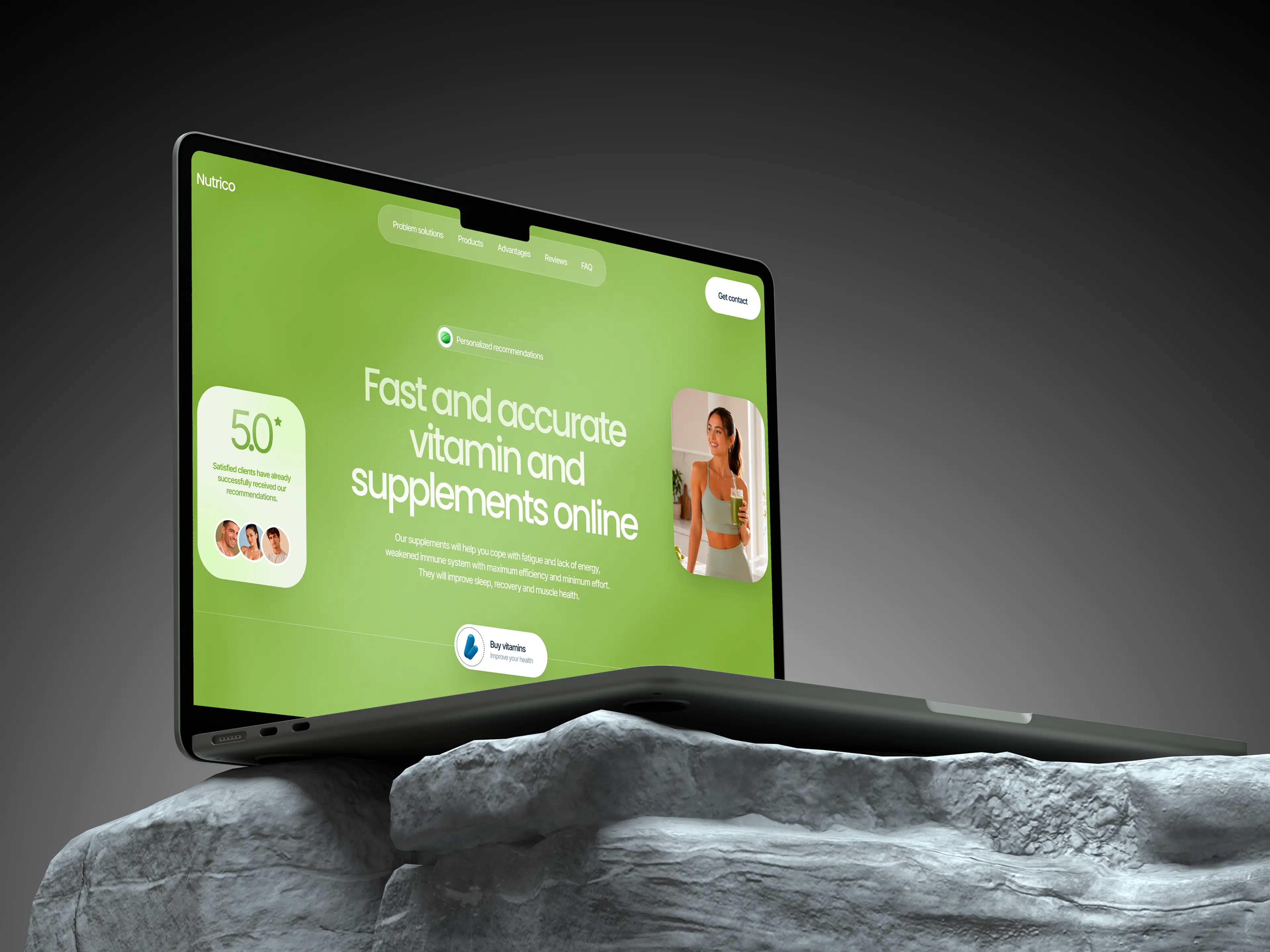
That was the case with Vitanet — a project at the intersection of wellness, e-commerce, and product thinking. The employer came to us with the idea for a service that would help users choose vitamins and supplements based on their goals, condition, and lifestyle, and then buy them in a convenient format. It was an ambitious idea, visually rich and full of life: not just a product catalog, but a digital product with a quiz, personalized recommendations, and thoughtful packaging.
This was one of those projects where design is not just about “making it look good.” At an early startup stage, design becomes a way to assemble the product as a whole: to understand how it works, what it promises users, how it communicates its value, and whether the team even has a shared understanding of what they are building.
That’s exactly why Vitanet stayed with us.
What kind of project it was
When the project came to us, it was still at a very early stage. The core concept was already defined, but the product itself had not yet taken final shape: the vitamins, packaging, and launch model were all still in development. What did exist was a fairly clear vision of the future user journey and the role the website would play within it.
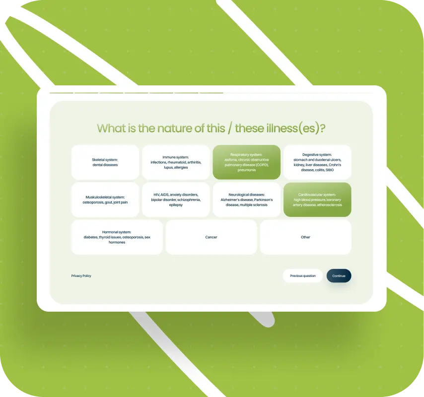
The user flow was clear from the start. A user would go through a quiz, answer questions about themselves and their condition, receive vitamin recommendations, and then either leave a request or move on to purchase once the product was ready for sale. Early on, the concept also included the idea of involving nutritionists, but over the course of discussions the focus shifted toward a more straightforward digital model: quiz, recommendations, lead capture, launch notification, and then an e-commerce flow.
From the user’s perspective, this was meant to be a clear and modern experience: not just a storefront full of bottles, but a service that helps people orient themselves and find the right solution for their needs.
Why this project interested us
We love working with early-stage products and startups. They almost never come with complete certainty, but they do offer what we value most: the chance not just to package an already finished solution, but to take part in shaping it.
At an early stage, a product usually doesn’t yet have stable positioning, a validated audience, a ready set of user insights, or a final functional scope. That makes the website not “the last step after strategy,” but one of the tools of the strategy itself. Through it, you end up clarifying what kind of product is being created, how it should appear in the eyes of users, and what hypotheses are built into it in the first place.
Vitanet was exactly that kind of project.
How the work started
Gathering inputs and shaping the task
The first phase was not about visuals. We started with product and structure.
The employer had a fairly concrete idea of what needed to be built. But that didn’t mean we could just take a ready-made brief and start designing. Everything had to be turned into a system. So in parallel, we clarified what kind of product this was, how the employer saw the future website, what job it needed to do, and what the user journey should look like from first touchpoint to receiving a recommendation.
Competitor analysis and reference points
Separately, we analyzed competitors — a list the employer provided themselves. We went through their websites, studied structure, presentation style, recurring patterns, strong solutions, and the places where we could take a different route. Some approaches we used as reference points, while others we consciously avoided so the new site wouldn’t feel derivative.
Importantly, this was not one of those situations where the employer arrives with a fully assembled document saying: first section — this headline, second section — this copy, third section — this button. Here, the structure emerged in the process.
How we built the site logic
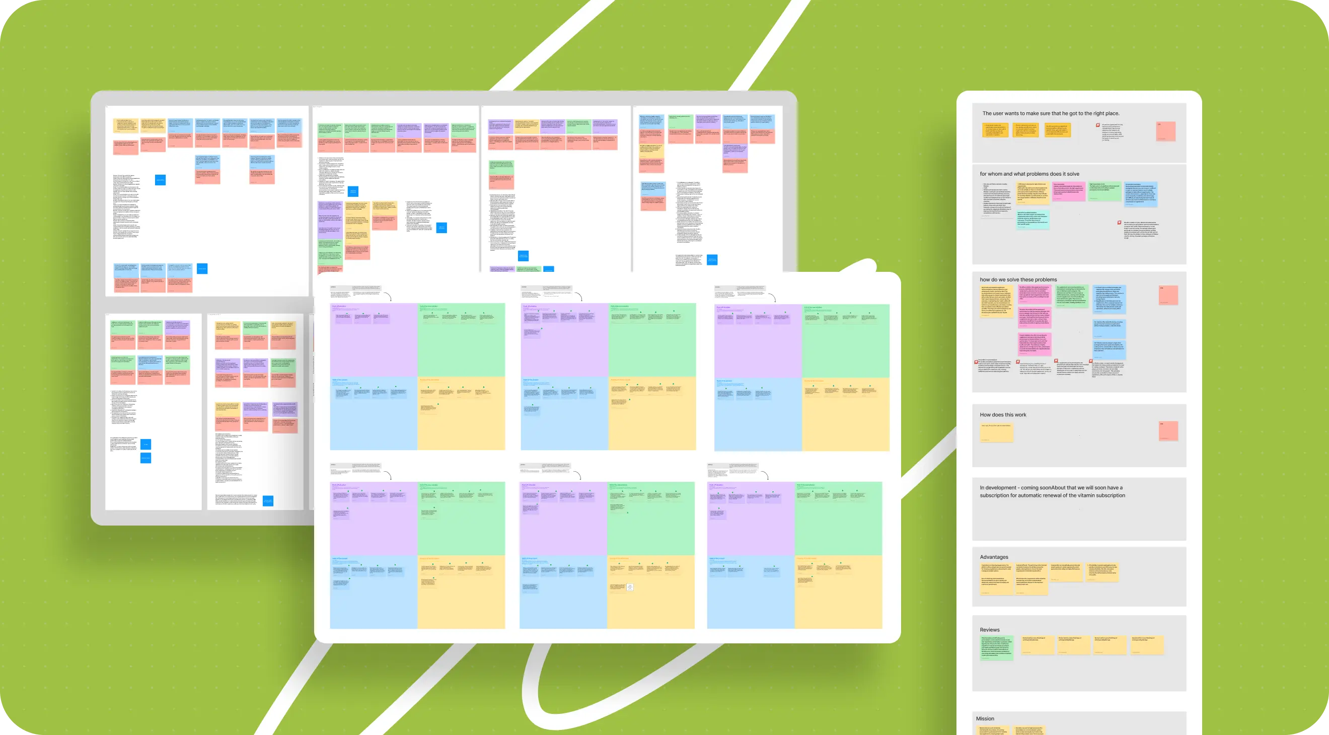
One of the most interesting layers of the project was how the page structure came together from scattered inputs.
When an employer says, “our audience is like this,” that is almost never enough. And if you ask a direct question like, “what are your audience’s pain points?”, not everyone can answer. Especially when it’s an early product that hasn’t really been tested in the market yet.
So instead of relying on formal questions, we worked through more precise and guiding ones. We wanted to understand:
- who exactly would use the service;
- what these people were looking for;
- what difficulties they run into when choosing vitamins;
- why this particular product should resolve their doubts;
- what its advantages were;
- what meaning the team itself was putting into the product.
Then all of that information was broken down, structured, and arranged into semantic blocks. Out of that logic, the prototype began to grow.
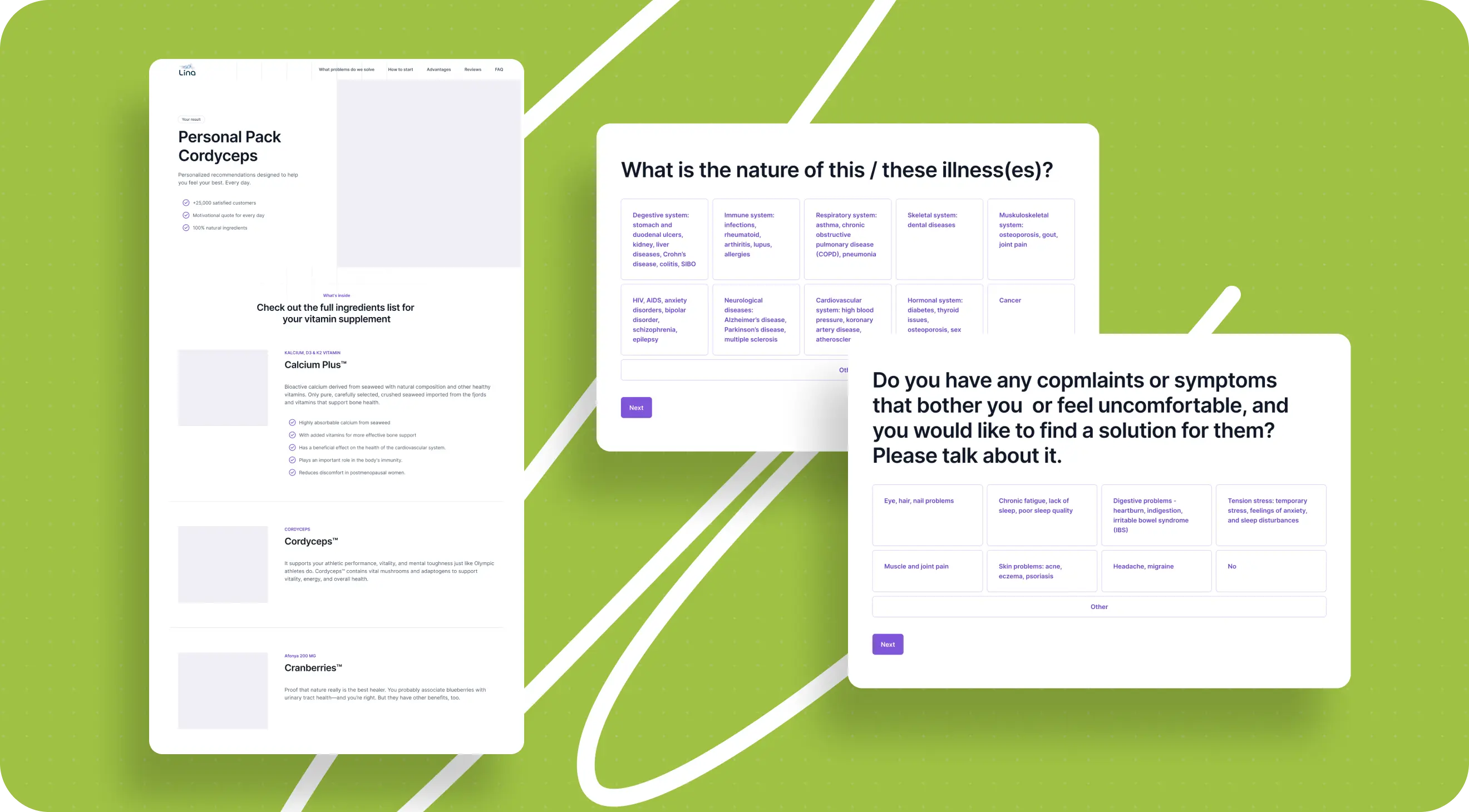
And it’s important to clarify: in this project, the prototype was not just a set of gray rectangles. It was the conceptual framework of the future site. One block in the prototype did not necessarily mean one block in the final design. Sometimes one idea split into several sections, and sometimes several thoughts were combined into a single screen.
That’s how the page logic gradually came together: what should appear in the hero section, how to reveal the value proposition, where to talk about the advantages, how to lead into the quiz, and how to guide the user toward action from there.
What was approved at the prototype stage
We always had the prototype approved by the employer before moving into detailed visual design.
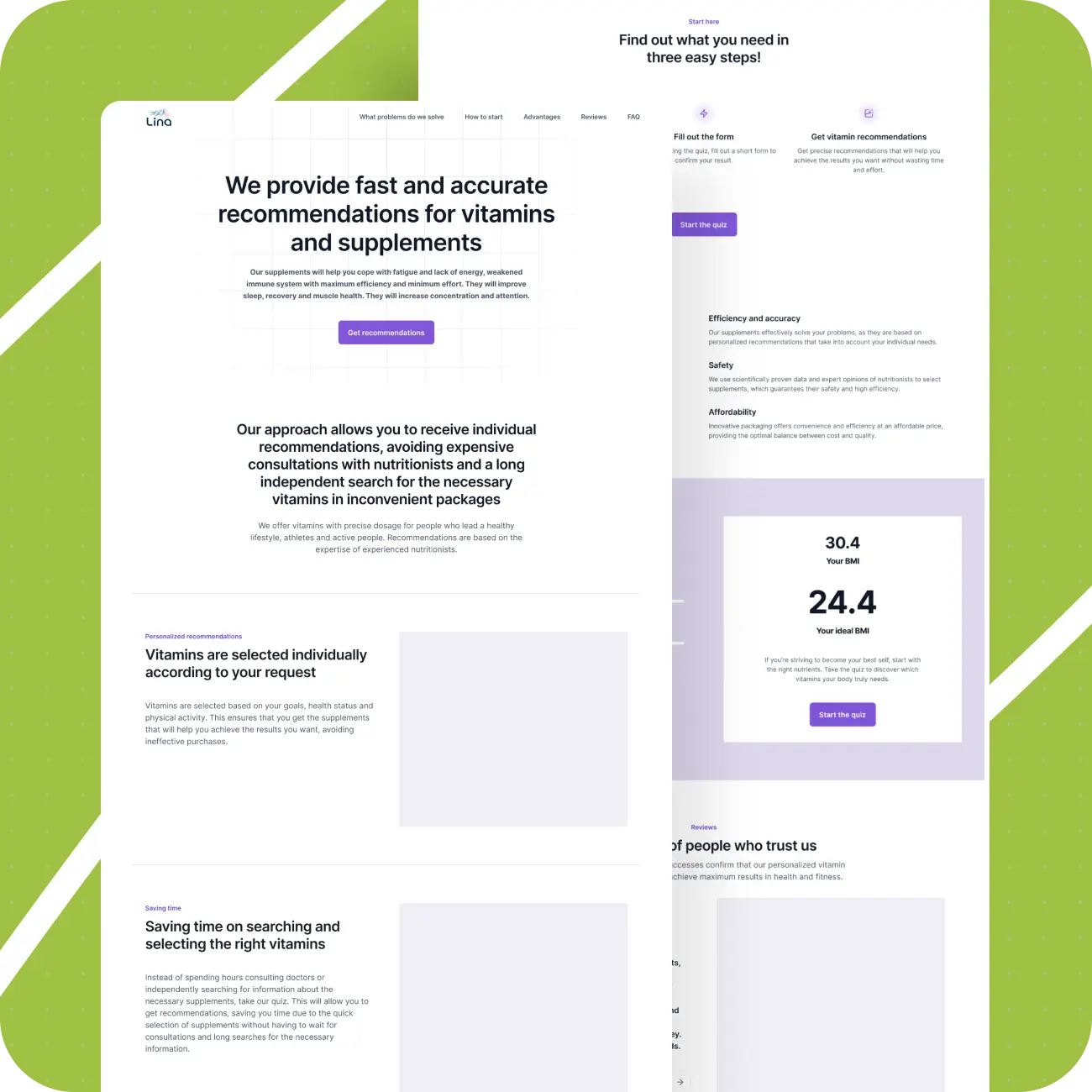
At that stage, the conversation was not about final aesthetics, but about logic. The employer could see the order of blocks, understand which meaning-bearing sections were already built in, evaluate whether anything was missing, and see whether there were enough touchpoints and calls to action. In essence, it was already a fairly close skeleton of the future site, with both the structure and the flow logic clearly visible.
At the same time, individual visual decisions could still change. A section that was shown as text with an image on the right could later become a block with a background image, cards, or a slider. But the sequence and meaning were already in place.
This was also the stage where the designer drafted rough copy. If a copywriter joined the project later, they already had a strong base: what exactly each block needed to say and why it existed at all.
What made this project especially challenging
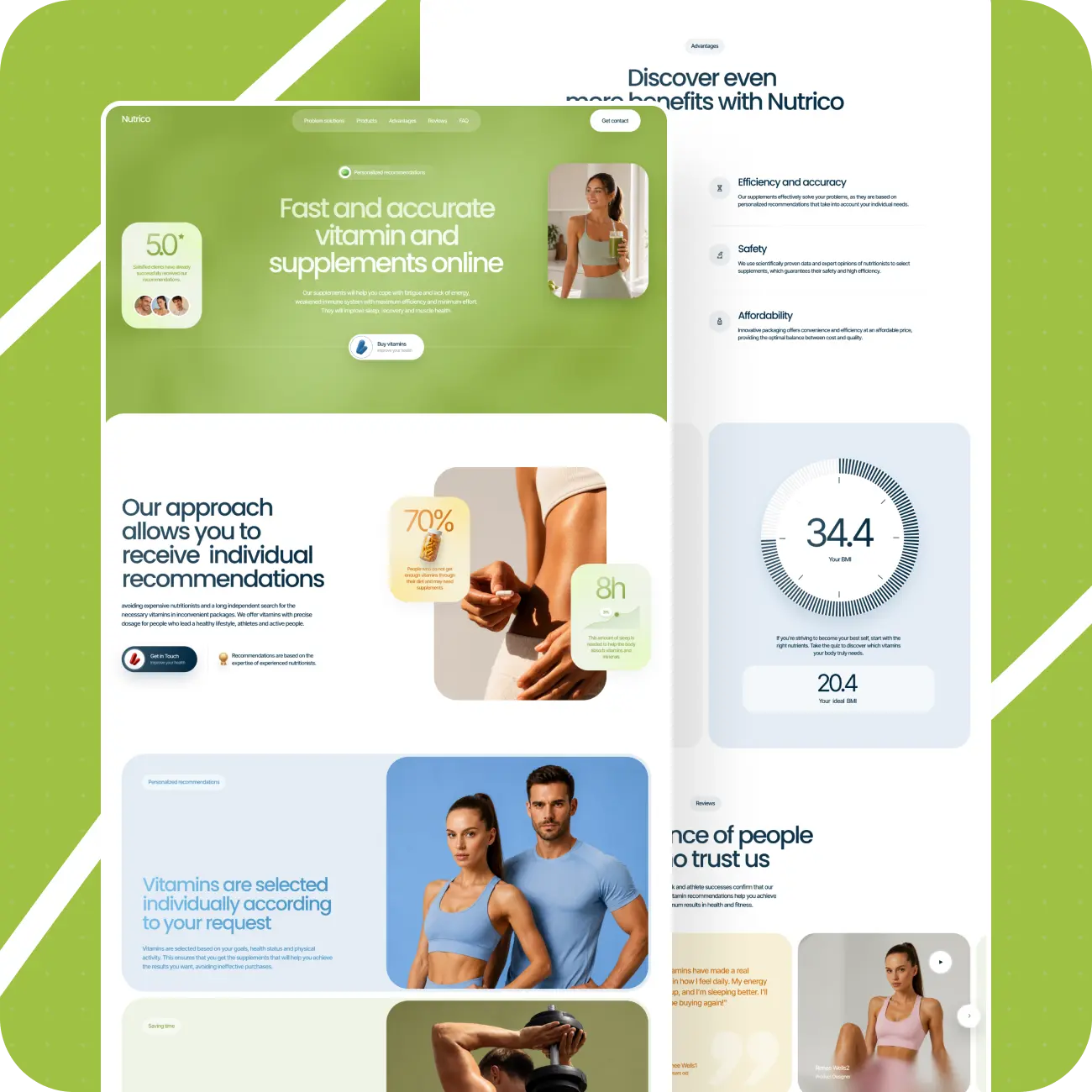
Once the structure was assembled and the prototype approved, we moved into design. And that was where the most labor-intensive part of the project began.
The employer had almost no ready visual content. And for a site like this, that content was critical. We had to build the project’s visual language almost from scratch: from large banner imagery to packaging, decorative vitamin elements, icons, and micro-interface details. And all of it had to feel like one coherent system.
From the outside, projects like this often look “easy” simply because they contain a lot of bright visuals. In practice, it’s the opposite: the more visual expressiveness you want to achieve, the more manual work is hidden under the hood.
How we worked with visuals
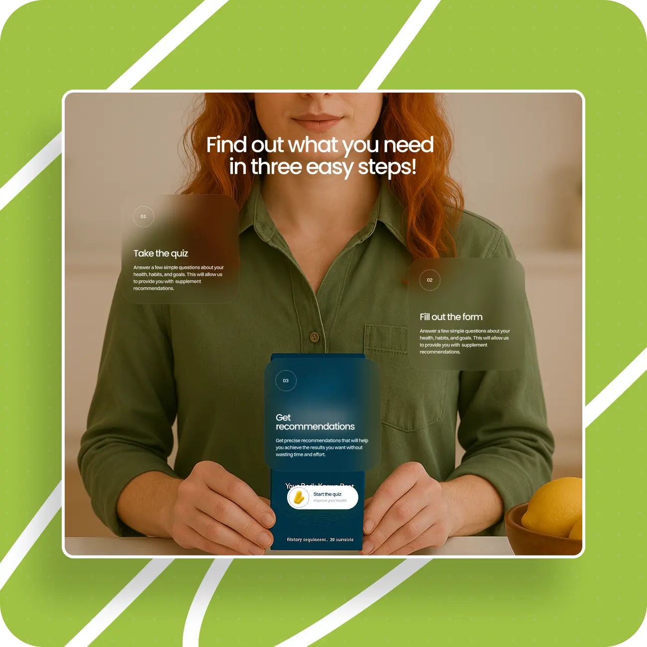
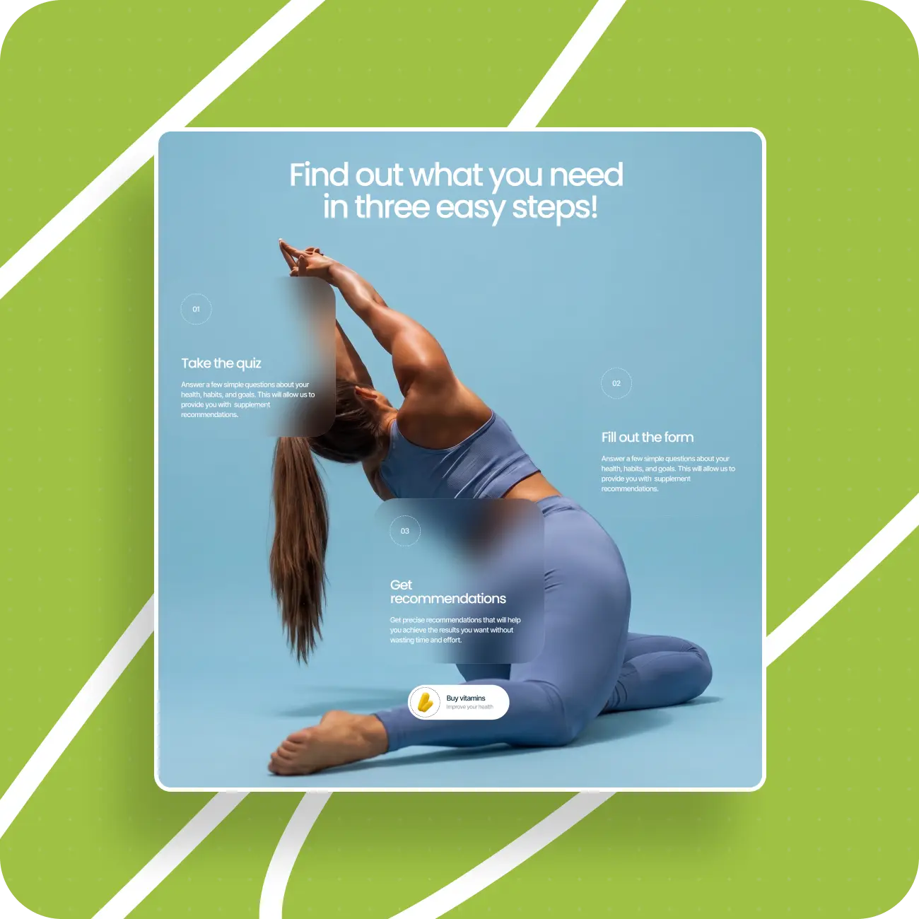
In this project, we used a combination of ChatGPT, Midjourney, Crea, stock assets, and manual refinement. But it’s important to understand that this was not a story of “one successful prompt.” In practice, almost no image appeared in its final form right away.
The process usually looked like this:
- first, we generated a simpler initial asset;
- then we used it as the base for the next tool;
- we strengthened the color, light, composition, and overall expressiveness;
- and only then did we fit everything into the broader visual system.
Sometimes we also used a stock photo — if it had a strong composition. But even in those cases, we almost always refined it manually, because in saturation, styling, or color it could still fall outside the overall visual level.
How a unified visual language came together
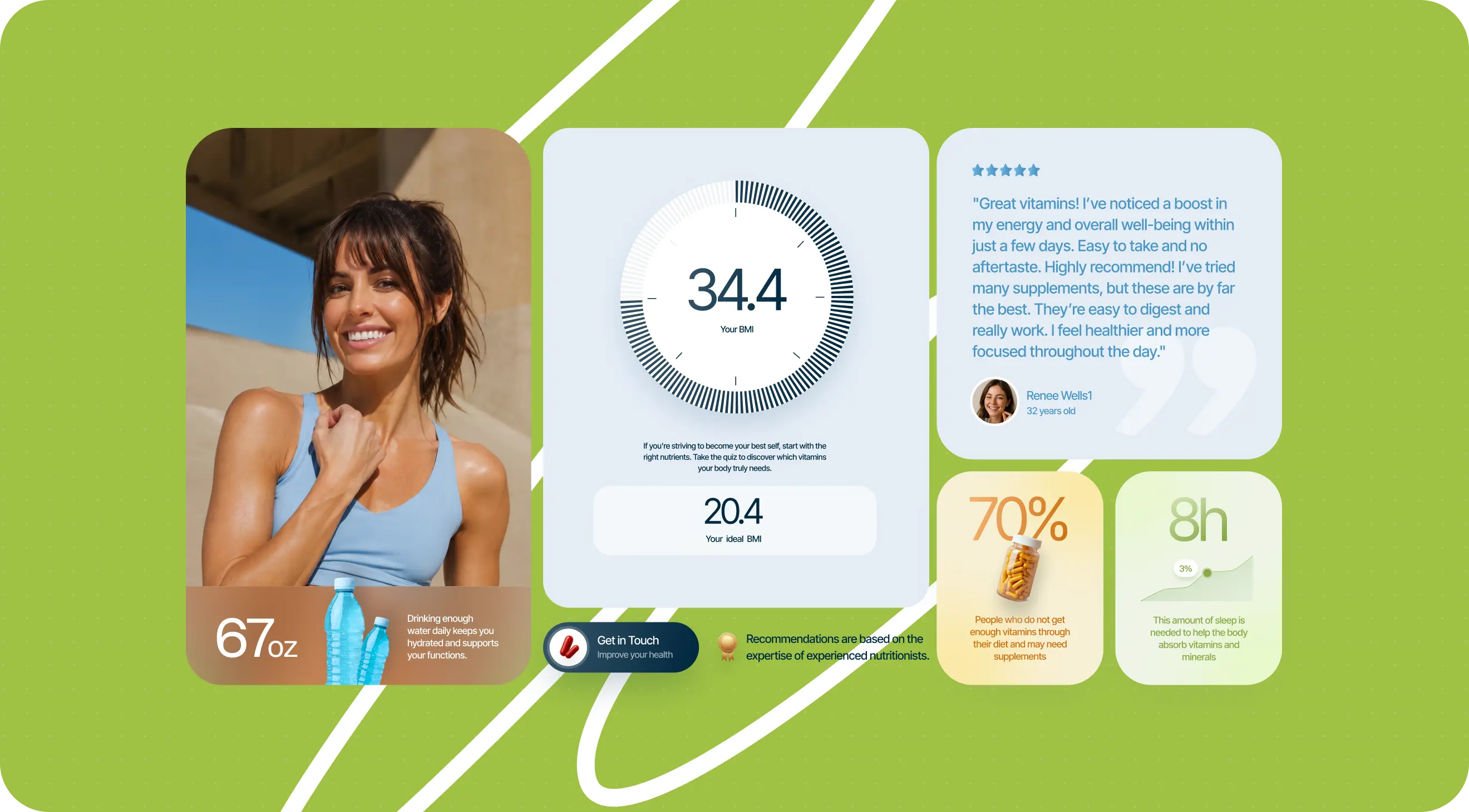
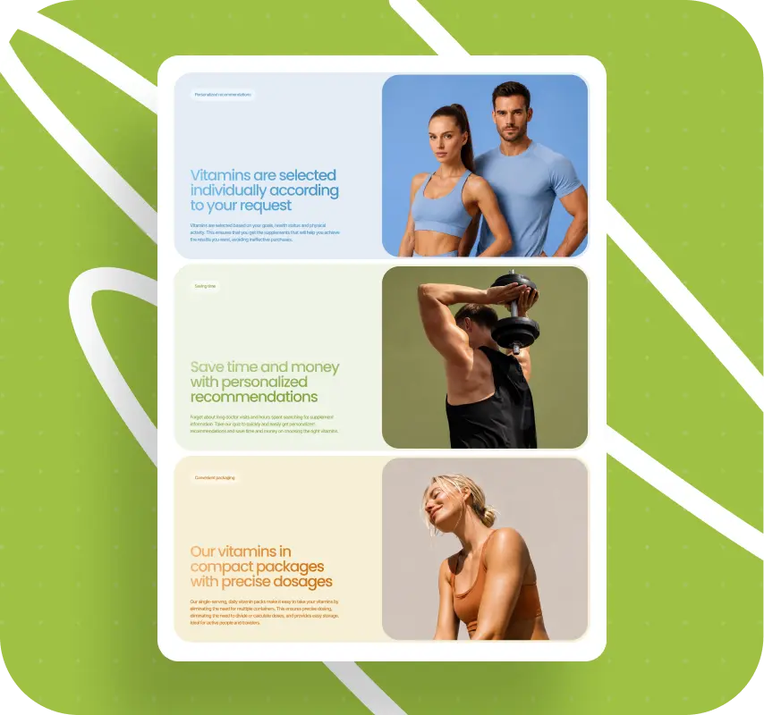
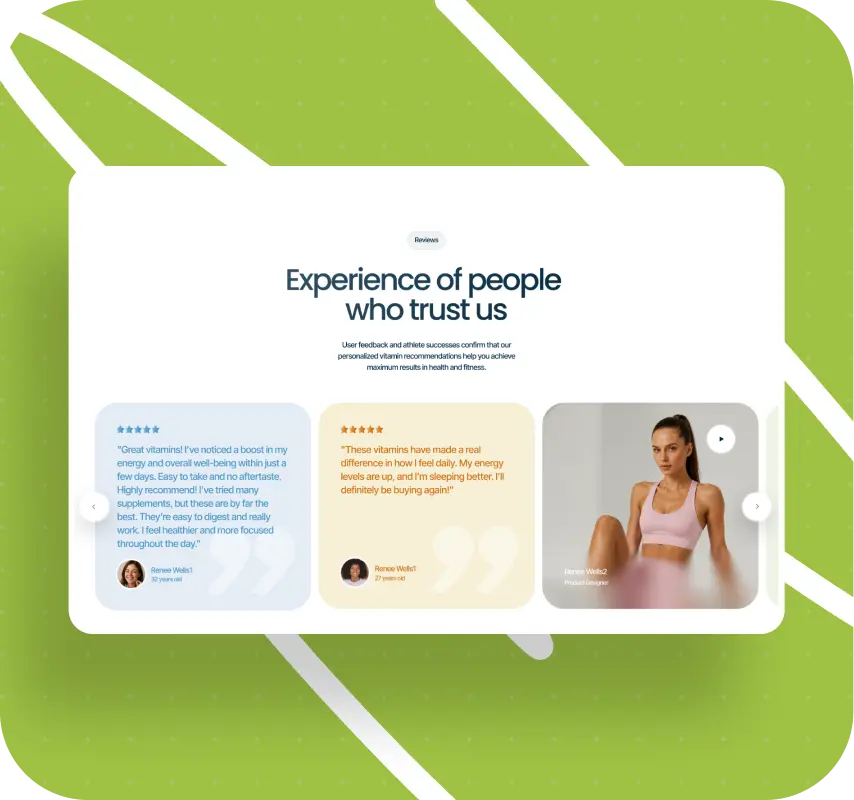
The main challenge was not getting one beautiful image. The main challenge was assembling a unified visual set out of many images — within one color palette, with similar lighting, and with the same sense of density and quality.
AI helped a lot here, but it didn’t remove the work. On the contrary, it gave us more flexibility, which meant more iterations. It made it possible to achieve things that are almost impossible to get from stock libraries — for example, a very precise color match between a card and the image inside it. A blue card paired with blue tones in the photo, a green card with a green background and green clothing on the character, a beige card in that same logic. That kind of visual echo makes an interface feel much more cohesive, but it takes a lot of time.
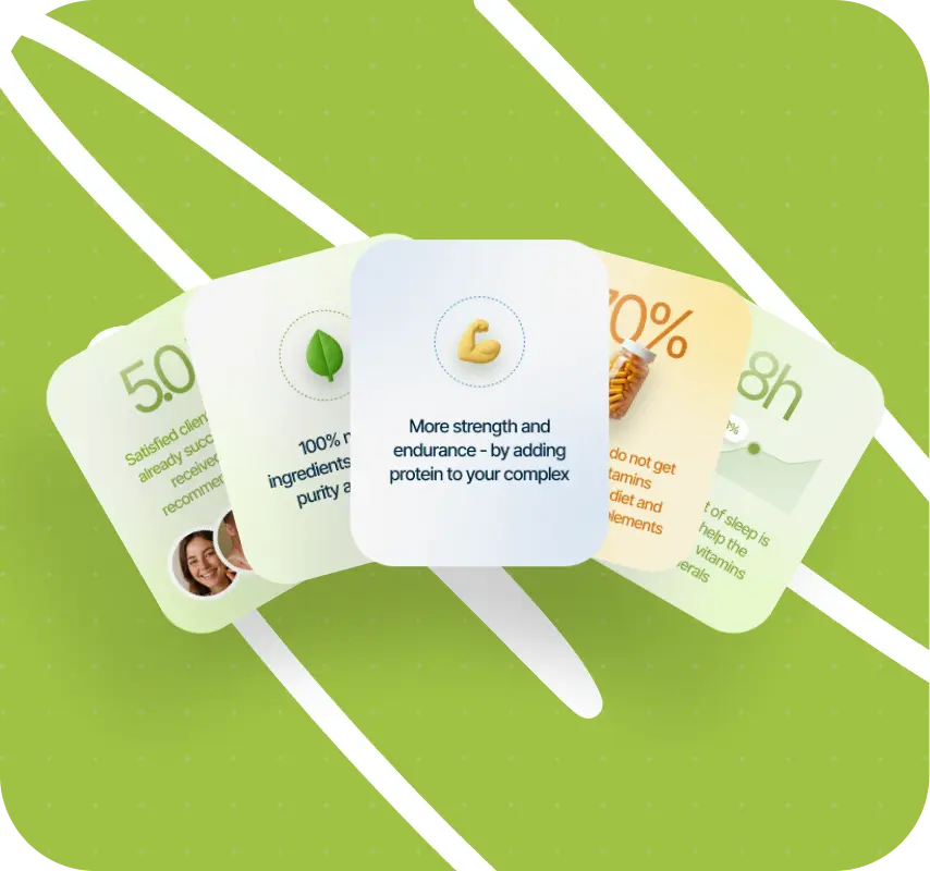
Where AI fell short
The work with branded packaging was especially revealing.
We tried to create scenes where a character was holding the employer’s branded bottle with the logo on it. But the AI kept distorting the object: breaking the letters, ruining the logo, deforming the lines of the packaging. At some point, it became clear that this particular part couldn’t be pushed to a believable final result.
So we made an interim decision: in the design, we would show the composition, mood, lighting, pose, and overall feel of the shot, while the real product photography could be added later, once actual packaging and a photo shoot existed.
That, by the way, is very typical of early-stage startup projects. Sometimes design does not close every gap all the way through, but instead creates an accurate framework for what still needs to appear later.
Micro-details that almost no one notices
Another highly labor-intensive layer of the project was the work on micro-details.
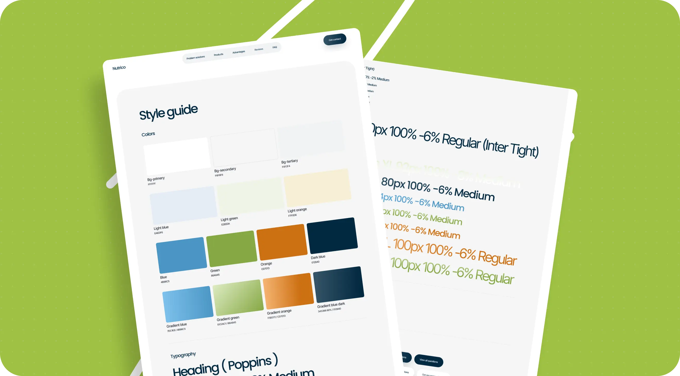
There were many decorative and interface elements in Vitanet: shadows, outlines, labels, circles, tags above headings, dotted lines, and buttons in different sizes and states. These are exactly the kinds of elements people rarely notice on their own, but they are what largely shape the feeling of cohesion and quality in an interface.
The difficulty is that you can’t just “set them up” once and never touch them again. The same element behaves differently in different sections. For example:
- a circle of one size looks harmonious in one place, but starts fighting with neighboring elements in another;
- buttons with different numbers of text lines require different proportions;
- a line weight that feels right in the first screen can read like an error by the third.
So a significant portion of the time was spent not on creating new blocks, but on refining already assembled screens until they felt internally balanced.
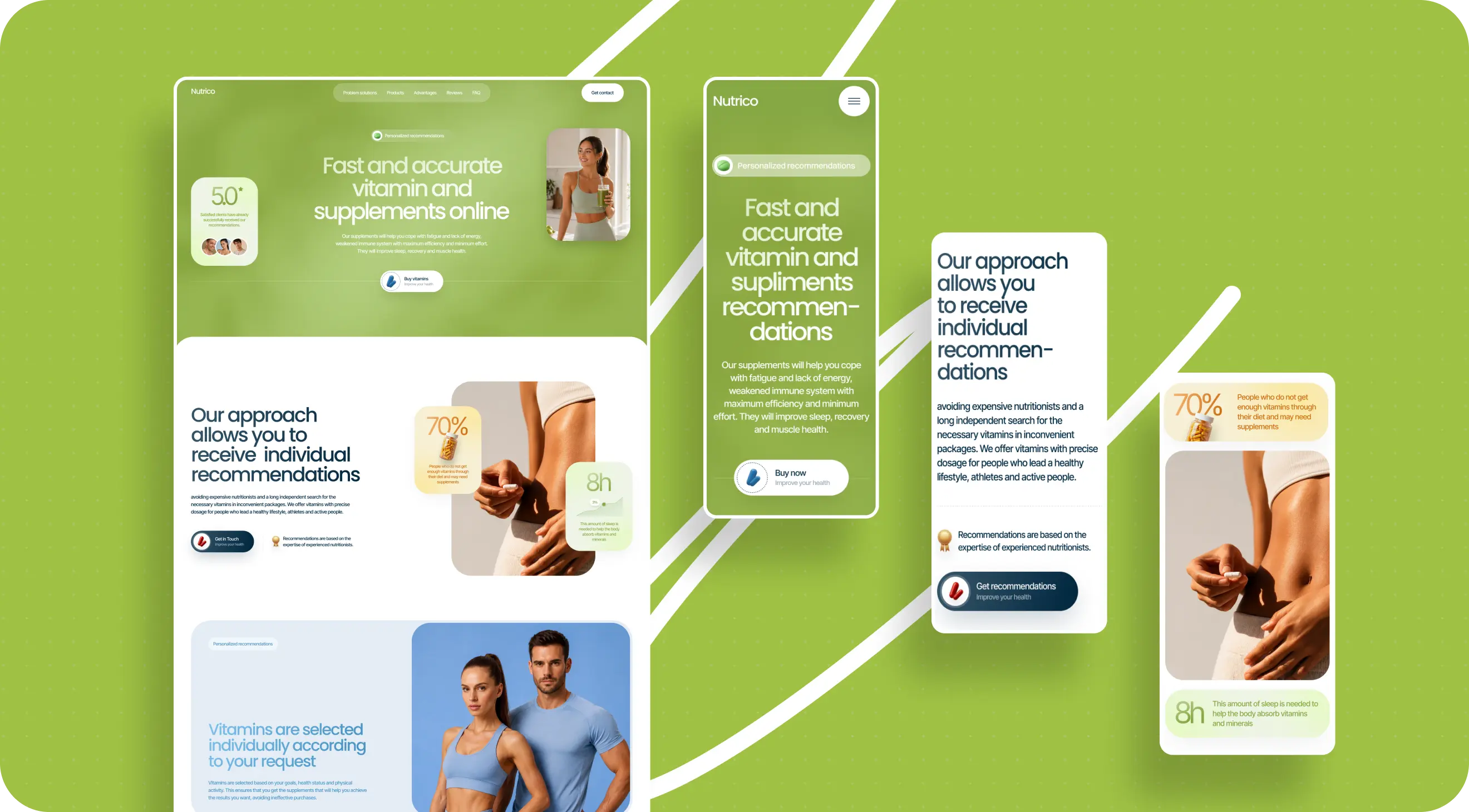
The mobile version added another layer of complexity. In interfaces like this, adapting for mobile is not just about scaling things down — it is essentially a rebuild. You have to revisit sizes, spacing, density, hierarchy, and the behavior of details in a completely different format.
What the result looked like
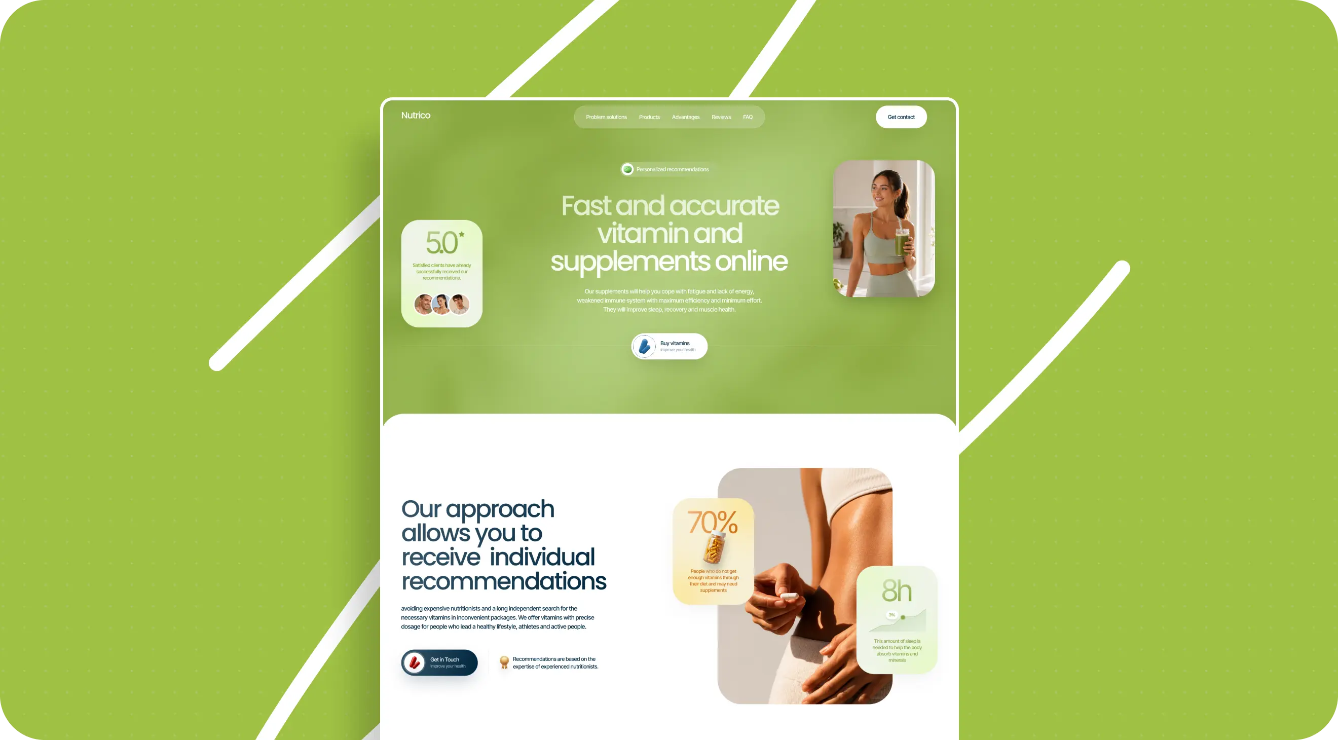
After the homepage was approved, we moved forward and started designing the next screens. One of the key ones was the results page after the quiz — the moment when the user has already gone through the flow and receives a more personalized response.
That was where we started building in ideas that made the product feel more alive. For example, the idea was that the user would see a specific box with the recommended vitamins, and in one scenario they could even enter their name so it would be printed on the packaging.
We also explored several ways of presenting that results screen:
- through benefit cards;
- through a split between morning and evening vitamins;
- through the visual image of energy;
- through a visual emphasis on natural ingredients.
At that stage, we had no sense that the project was stalling. On the contrary, it felt like one of those cases the team saw internally as strong, promising, and genuinely alive.
When the difficulties started
What actually happened was this: at first, the project was moving well, there was positive feedback, the prototype was approved, then design moved forward, and after that the following pages were approved as well. But at some point, communication from the employer started to change. Another stakeholder appeared in the process. The project began to hang, and eventually it stopped altogether.
We can’t say for sure what the deciding factor was. We don’t have the right or the basis to claim that as fact. But in retrospect, it seems to us that the difficulties may have had less to do with the quality of the work itself and more to do with a change in the project’s internal configuration on the employer’s side. Maybe the vision was shifting. Maybe the expectations of different participants were not fully aligned. Maybe the product itself simply wasn’t fully defined internally at that moment.
To emphasize once again: these are not established facts, only our interpretation of what happened from our side.
One conclusion we drew about ourselves
After the project, we discussed internally not only the employer’s behavior, but our own as well.
During the work, there were moments when we defended certain design decisions quite firmly. Color decisions, for example. And that is natural: if people come to you as experts, you don’t want to mechanically execute everything you’re told, especially when you can see a risk of weakening the result.
We still consider our expert position important. But this project reminded us once again of the fine line between an honest professional warning and excessive insistence. We don’t know whether that played any role in the fate of the project.
But the conclusion we drew for ourselves was this: you should voice your position, but do it as carefully as possible. And if the employer consciously chooses another route several times, don’t turn the work into a fight.
This is not a story about staying silent and always agreeing. It’s a story about the fact that expertise also requires the right form.
Why we decided not to let this project go
When it became clear that the project would not launch in its original form, that was disappointing for the team in more than just a commercial sense.
The hardest part about situations like this is when strong, thoughtful, genuinely alive work simply ends up in the archive and helps no one. And we liked this project. We liked the idea itself, the depth of the structure, and the amount of attention that had gone into the visual system and the details.
So instead of letting the project remain an unrealized artifact in Figma, we started looking for a way to preserve the value that had already been built into it.
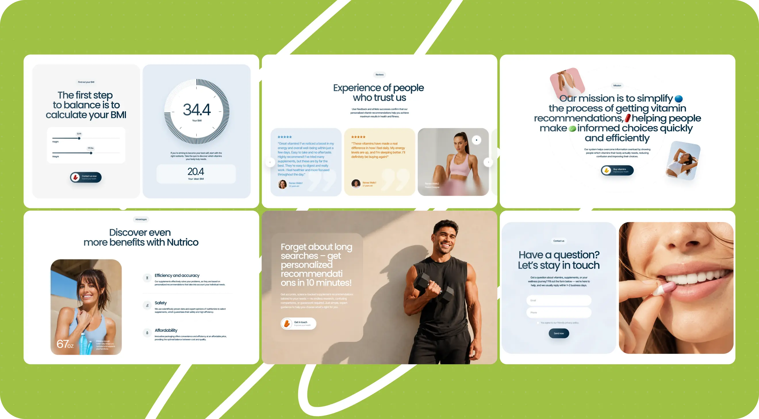
How Vitanet became a template
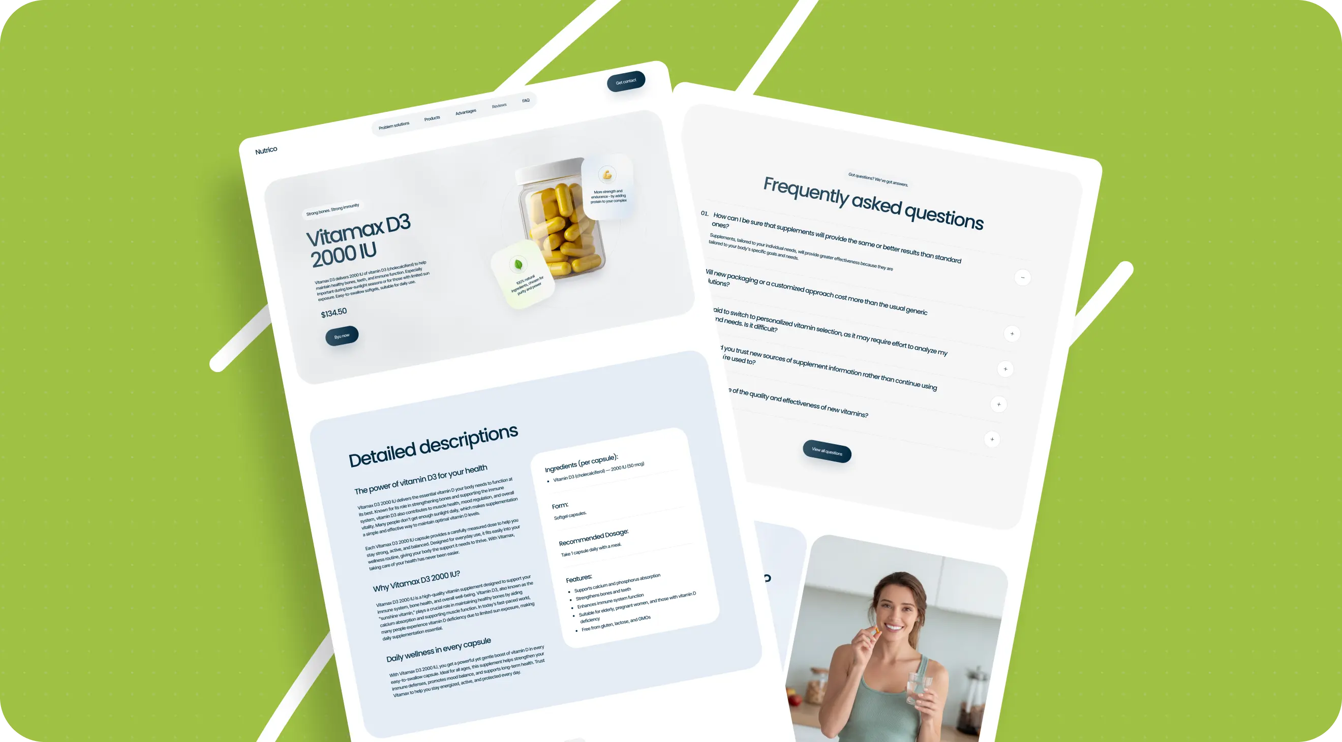
Using the design we had already created as a base, we adapted the project into a template format. We removed the employer’s unique branded elements, replaced the branded box with more neutral packaging, and added new pages that had not existed in the original version.
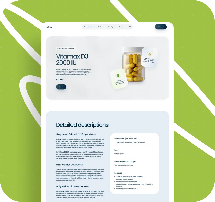
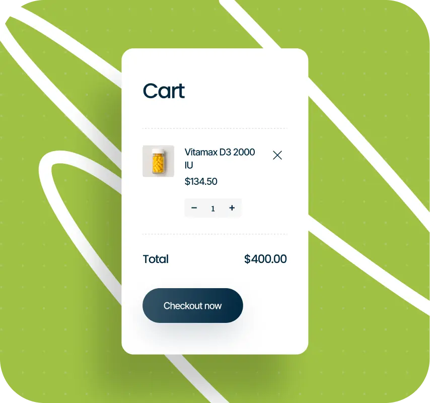
That gave the project a broader structure. The template included a vitamins listing page, cart, blog, checkout, and utility pages like privacy policy. In other words, instead of leaving the work as an unlaunched concept, we turned it into a working asset that could be useful to a business with a similar task.
What this project gave us
Vitanet did not make it to launch in the form we created it in. But it confirmed a lot for us.
It reminded us of several important things:
- at an early startup stage, design is not just a way to package a product, but part of building the product itself;
- a prototype is not a formality, but a thinking tool;
- AI does not replace design work — it only changes the nature of that work;
- micro-details still matter.
It also reminded us that a project’s fate is not determined by design quality alone. Sometimes the reasons a product stalls lie outside the work itself — in timing, alignment, or the product still being internally undefined.
That, perhaps, is the main lesson of the whole case.
Conclusion
Now we look at Vitanet as a strong piece of work that never made it into production, but also did not disappear without a trace.
We still really like this project. It turned out modern, lively, visually rich, and product-wise far from generic. You can feel the manual work in it, the attention to detail, and the attempt to create not just a beautiful site, but a clear digital experience around a product that was still taking shape.
But if we had to put it very simply, Vitanet taught us one important thing: strong design does not always lead to launch, but strong work does not have to disappear.
So we did not leave this project in the archive. We turned it into a template so it could keep working — in another form, for another business, but with the same idea of usefulness it was originally built around.
Sometimes the best way to finish an unlaunched project is not to forget it, but to find a new life for it.
That’s exactly what we did.
If this kind of project feels close to you
If you’re also working on a wellness, supplement, or e-commerce product and need a modern, visually strong template with already thought-through logic, this work might be a fit for you.
We can adapt the template to your brand, refine the structure around your product, and help you launch. If you’d like, we can show you what it looks like now and how it can be turned into a working product for your business.
Awards
About Digital Butlers
We’re Digital Butlers — a design-led team of 27 senior specialists building digital products since 2016. By choosing us, you’re getting results that are way different from what you already have — with the same commitment to your goals that Alfred has for Batman.
If you need a website, web service, or mobile app that pays off, reach out to us — we do it well.
Digital Butlers — a mature team with mature processes that deliver consistent results.


Let’s discuss your next website.
My name is Alex, and I’ll help you define the right next step.