We Built the Right Site. Then Changed It

We've already told the story of the Salient PR website in our case study: how it all started, what we built, and what came out of it. But a case study is a showcase. It shows you the solution, not the road to it. And on this project, that road was unusual enough that it deserved its own story.
Short version: the employer came to us with one task, we got halfway through the project, and then they completely changed their mind. The goal shifted, the approach shifted, the entire logic of the site shifted. From the outside, that can look like chaos. What we actually want to show is the opposite: how teamwork and a deeply engaged employer pushed this project further than anyone planned at the start.
How It All Started
Justin, founder of Salient PR, an independent PR agency for tech startups, reached out to us. Sasha, our account manager, took the first call, ran through our standard discovery questions, and came back with a brief.
The request was refreshingly specific. Justin set his own priorities: conversion and SEO came first, design wasn't even in the top tier. He told us outright that content architecture and rankings mattered more to him than how the site looked.
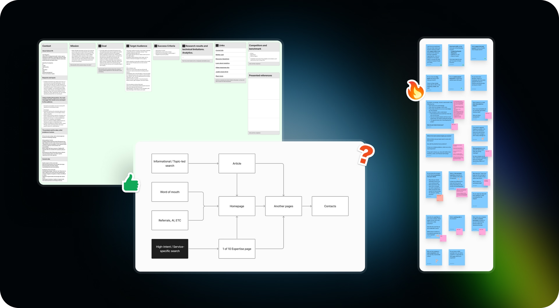
When conversion's the goal, we always start in the same place: the user flow. It's a line we've repeated to employers for years: a website doesn't have conversion. The traffic source does. A website doesn't convert everyone equally. It converts something specific, and each traffic source does it at a different rate.
We broke Salient's audience into three streams:
- Referrals and word of mouth: people Salient was recommended to. They land on the homepage. The hottest audience, since they're already aware of the problem and want to solve it.
- Service-specific Google searches: land on one of the expertise pages built around a specific niche. A slightly less warm audience, more likely to be comparing competitors.
- The blog: the biggest traffic volume, but the earliest stage of awareness.
Then we asked Justin the question that actually mattered: how many leads and how many closed deals come from each channel. Because you can't "improve conversion" without an answer to that. It's a goal with no target to aim at. We have a rule: double down on what's already strong. If 60% of traffic converts at 10% and 10% of traffic converts at 60%, you work on the second one, no matter how tempting the volume of the first looks.
It turned out referrals weren't Salient's biggest traffic source, but they closed the most deals. So that's where the effort needed to go. We flagged it and went deeper.
For what it's worth, if the blog had ended up being the bigger driver of leads instead of referrals, we would've taken a completely different approach. We have a rule: if an article is already pulling 500+ visits a month consistently, it's time to reinforce it with hooks: a capture banner up top, a lead magnet somewhere in the middle, another close at the end.
In other words, the effort would have shifted from designing site sections to content strategy and email flows. That's not how it played out for Salient (referrals won), but testing the hypothesis was still part of the process, not something we skipped.
Fun detail: we noticed Salient's site structure was strikingly similar to our own, both in logic and in tone. That coincidence came up in conversation and, we think, helped us click with Justin faster than usual.
Research: Why the Employer Isn't the Same as Their Audience
Once designer Dima joined the project, he got up to speed on the whole thing from Sasha and me, then went heads-down on his own research for a full week: no other projects, just this one.
While Justin ran interviews with his own real clients (we put together a brief for him; sometimes that works better than us doing it), Dima was digging through Google Analytics and mapping competitors in parallel: strengths, weaknesses, what worked in UX, what didn't.
That's where our first real challenge showed up: Salient's Google Analytics was set up "bare," with no goals and no configured events. It basically told us nothing about how the audience actually behaved on the site. We had to reconstruct that picture not from data, but from the brief and interviews, building hypotheses where we'd normally lean on numbers.
Here's an important principle we follow on every project: we always brief the employer separately from their audience, even when interviews with real clients are on the roadmap. The reason is simple: an employer usually tells you what they want to say about themselves, not what the audience wants to hear. That's honest information, but it's one-sided. It creates a useful contrast: where the owner's read on the business lines up with what real clients think, and where it doesn't.
Jobs To Be Done: Pull to Progress, the Offer, the Objections
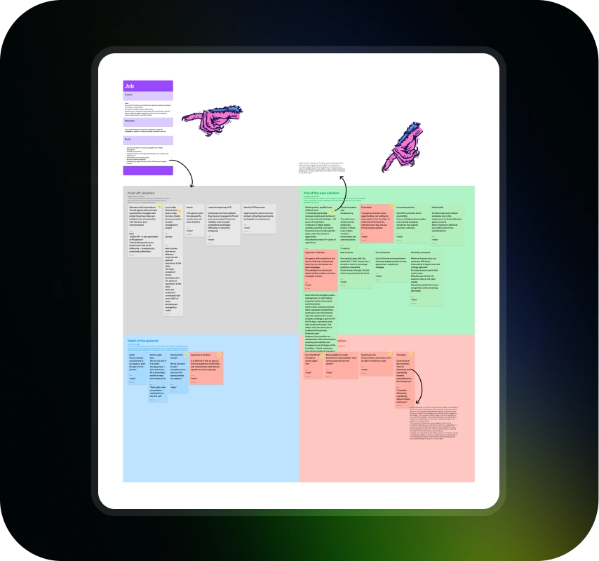
From everything he'd gathered, Dima put together a Jobs To Be Done map: a framework that helps build not a list of features, but a full business pitch. Dima likes to explain the logic through how Apple pitched Face ID: Touch ID users had built-up frustration (doesn't work with gloves, doesn't work with wet hands, false triggers), and that's the pull to progress. Apple offered a solution. Then came the objection-handling (fear that someone else's face could unlock the phone) and the cost of change (what if it's expensive).
For Salient, the same logic looked like this:
- Pull to progress: the audience is worn out by their current PR agency, dealing with unmet expectations, junior staff turnover, and weak communication.
- The new offer: Salient's alternative, where the owner personally leads every project, brings 20+ years of experience, and stays proactive instead of waiting for the client to chase them.
- Objection: the fear that this agency won't deliver results either.
- Cost of change: the exhaustion of explaining everything from scratch to yet another new vendor.
This is also where one of our core copywriting principles was born: the best headline on a website is the audience's own words, in their own language. Not our polished phrasing. Theirs, verbatim.
How Research Turns Into Website Copy
The copywriter takes the JTBD map and breaks it down into epics, and epics into user stories: small, concrete "the user wants to make sure that..." statements. Those stories get assembled into a text presentation, basically a pitch, as if Justin himself were telling someone about his business in person. Only then does that text presentation get translated into landing-page language: headlines, subheads, microcopy.
Alongside that, we have a set of internal landing-page rules that apply regardless of the project:
- The first section always answers "did I land in the right place." Otherwise the user starts doom-scrolling, and you lose control over what they latch onto.
- Before showing the offer, you need to build up value. Otherwise the user gets sticker shock.
- For a product, trust in the product comes first, then trust in the seller. For a service, it's the opposite: trust in the provider comes first.
- After stating the price, always reinforce it with bonuses and perks they didn't expect.
- At every step, the user needs to confirm that what they need is actually here. Otherwise, they'll bounce.
And a separate principle we also walk through with every employer: you can't and shouldn't try to please everyone. A site that tries to work for everyone works for no one. So we took that one audience, referrals looking to replace their agency, and built the homepage entirely around them. Every other segment finds what they need on other pages.
That's how the first full wireframe came together: a homepage built for referrals, packed with proof points and FAQ, plus expertise pages for SEO traffic that the copywriter built out from keyword research.
It was a strong version. It solved exactly the problem Justin had come to us with.
Breaking the Paradigm
And then came the part that made this whole separate article worth writing.
The audience interviews didn't just leave a mark on us. They stuck with Justin too. He kept thinking about it even after we showed him the finished wireframe, and at some point he landed on a realization: conversion actually mattered to him less than the impression the site made.
He changed the goal. Conversion moved to the back seat, brand impression took the front.
We won't pretend that was easy to accept. But it's a genuinely interesting fork in the road when it comes to how different types of websites work.
A conversion site is usually built on fairly long, explanatory headlines. We work on the assumption that most people, on their first visit, read only the headlines and not the full copy underneath. So if you don't pack a concrete benefit or differentiator into the headline itself, it simply won't stick. The person closes the tab and doesn't remember what set you apart, even if it was written in fine print just below.

A brand site works differently. Headlines get shorter, more metaphorical, more intriguing, because the job isn't to "explain everything at once," it's to create an impression and a feeling. It doesn't state things outright, it hints. And its success isn't measured by conversion, but by what happens in meetings with clients: "Your site is great, you can tell right away you're serious."
Justin rewrote part of the headlines himself. "Salient — the proactive Tech PR team that brings ideas to the table" and "The Traditional Agency Model is Broken" became "Be the story" and "Not another agency origin story": shorter, more evocative, with room for metaphor.
And that's where a problem came up: the site's old structure was built for conversion logic, with testimonials, FAQ, and detailed comparisons baked in. It just didn't fit the new voice anymore. It felt like two different worlds colliding in one layout.
The fix turned out to be simple in hindsight, though it wasn't obvious from inside the process: we didn't have to choose between the brand and the substance. We just split them across different pages. The homepage became light, airy, brand-first. All the technical, detailed stuff (testimonials, comparisons, proof) moved to a separate Why Salient page. An About page was added too, more human, more editorial, about the people behind the brand.
Baseline Design or Award-Level
Another turn happened at the design stage. Once the goal shifted toward brand, Justin came back to us himself with a question: could we push the design up to the max level?
We have someone on the team specifically for this: Denis, our art director, who oversees award-track projects and pushes the team's design language forward. The difference between our "baseline level" (which is already pretty high on its own) and our "award level" isn't about the quality of the idea. It's about depth of execution: animation, build quality, consistency down to every detail. It usually adds one and a half to two times the hours.
A good example is our Solana project. The baseline version we delivered to the employer took 193 hours. The version that went on to win design awards (same site, same colors, same fonts) needed another 186 hours on top, mostly animation. We say this a lot on the team: animation is half the success of a brand site. Not what it says, but how it feels to interact with.
The key difference in award-level design isn't a special style. It's removing the constraints. On a regular project, we work within do's and don'ts: what the employer likes, what they don't. Those constraints are useful, since they keep a project from sprawling. But they also stop you from making something award-winning. We told Justin straight: if you want a site that can win awards, drop the restrictions, and we'll treat what you like as a reference point, not a boundary.
How the Black Version Was Born
We had two different concepts ready. The first stayed close to Justin's preferences: centered layout, gradients he liked. The second was bolder, built not around the employer's preferences but around the goal: create a wow factor, be memorable. Different fonts too: serif ones, nodding to print publications, along with a different overall composition.
Justin picked the first concept as the base, but letting go of the earlier constraints was what let us push it into something bigger.
The core idea came straight from the brand's name. Salient roughly translates to "prominent, standing out," and in Justin's positioning, "be visible." From there came the visual metaphor: light emerging from darkness. That's how the black version of the site was born, not because a dark interface automatically looks more premium, but because, within that logic, it became a stage for light and emphasis.
Interesting side note: Justin himself wasn't a fan of dark sites going in. But the idea was precise enough that it overrode his earlier preference. You can see how it turned out in the case study.
A Restaurant, Not a Fast-Food Joint
There's a metaphor that, we think, best captures the difference between the old and new versions of the site. A conversion site is like a fast-food menu: everything in pictures, so people understand fast and don't have to spend time with a server who's really just there to bring the order.
A brand site is like a menu at a nice restaurant: barely any pictures, but a server who explains, guides, helps you choose. The second version of the Salient site became exactly that: copy that guides you, rather than just listing things off.
The About Page: The Brand's Voice Through People
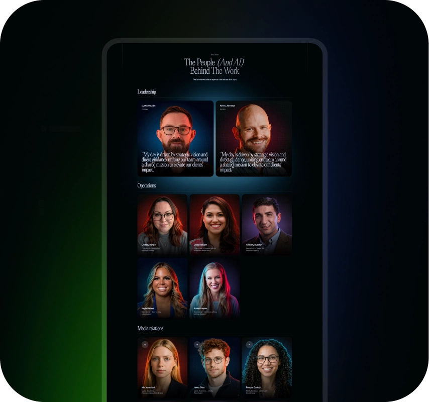
The About page got a literary, line-by-line layout: you read top to bottom instead of scanning a glossy grid. For an agency that writes stories for newspapers, that felt like the right gesture. And there's an honest moment here too: the first team photos Justin sent didn't work, so we had to rebuild the section from scratch. The employer's condition was non-negotiable: real photos only, nothing AI-generated.
One more detail about the About page that nicely ties back to how we opened this piece. Justin himself proposed some of the visuals for the page. He's decent with Sketch and code, put together his own drafts, and the team refined them to match the overall style: adjusted the color, cleaned up the background.
And before that, this same page had a 3D object shaped like the state of Texas, Justin's own personal reference idea, which he later asked us to take down himself. A small detail, but it says a lot about how this whole project ran on genuine collaboration, not an "agency builds, employer signs off" model.
Challenges That Didn't Make the Case Study
A few moments where the answer didn't come right away, on the first try: details that say a lot about the process but never fit the case-study template.
- We wanted a dynamic blur effect under the headline, but Safari still handles that technology poorly, and the site started lagging. We had to drop the idea and go static instead.
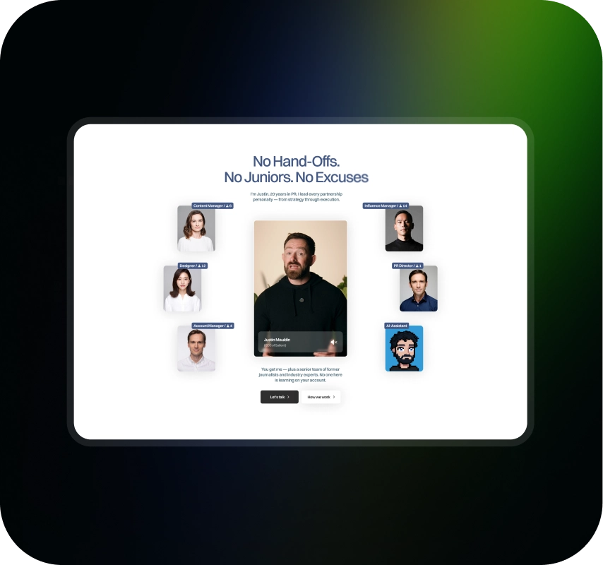
- The team section had to answer a specific audience objection we'd surfaced back in the JTBD stage: the fear that a small team couldn't handle large-scale PR for a big client. Getting there wasn't a straight line. First came real photos and titles. Then abstract circles, but the chaos and mismatched colors didn't land. Then symmetry with a carefully built color transition. In the end, the designer added a unifying circle just to "bring the composition to life." That circle worked so well it became part of the overall design language and showed up again in other sections of the site.

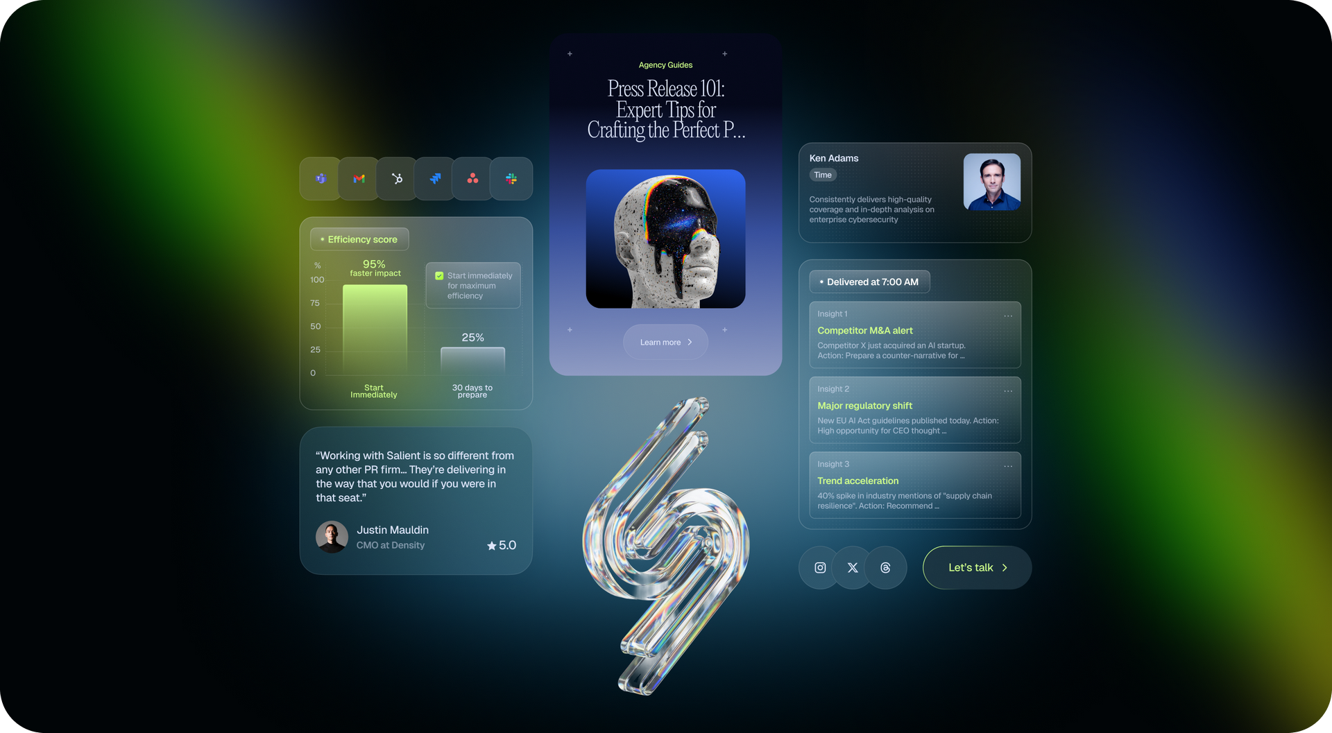
- The case study section was originally meant to be something more interesting than a website screenshot. In the award-level version, cases turned into large abstract allegorical objects, dreamed up together with Justin himself, who was actively involved in the process. Cases got this much attention for a reason: the team has noticed again and again that they, not the homepage hero, are usually what actually convinces someone to fill out the form. They read the story, recognize their own situation, and reach out. That's backed up by the agency's own experience too: on our own site, case studies remain our top source of leads.
- The whole page's composition followed a principle Denis likes to explain through a poetry allegory: alternating "heavy" and "light" sections by information density, like stanzas and line breaks.
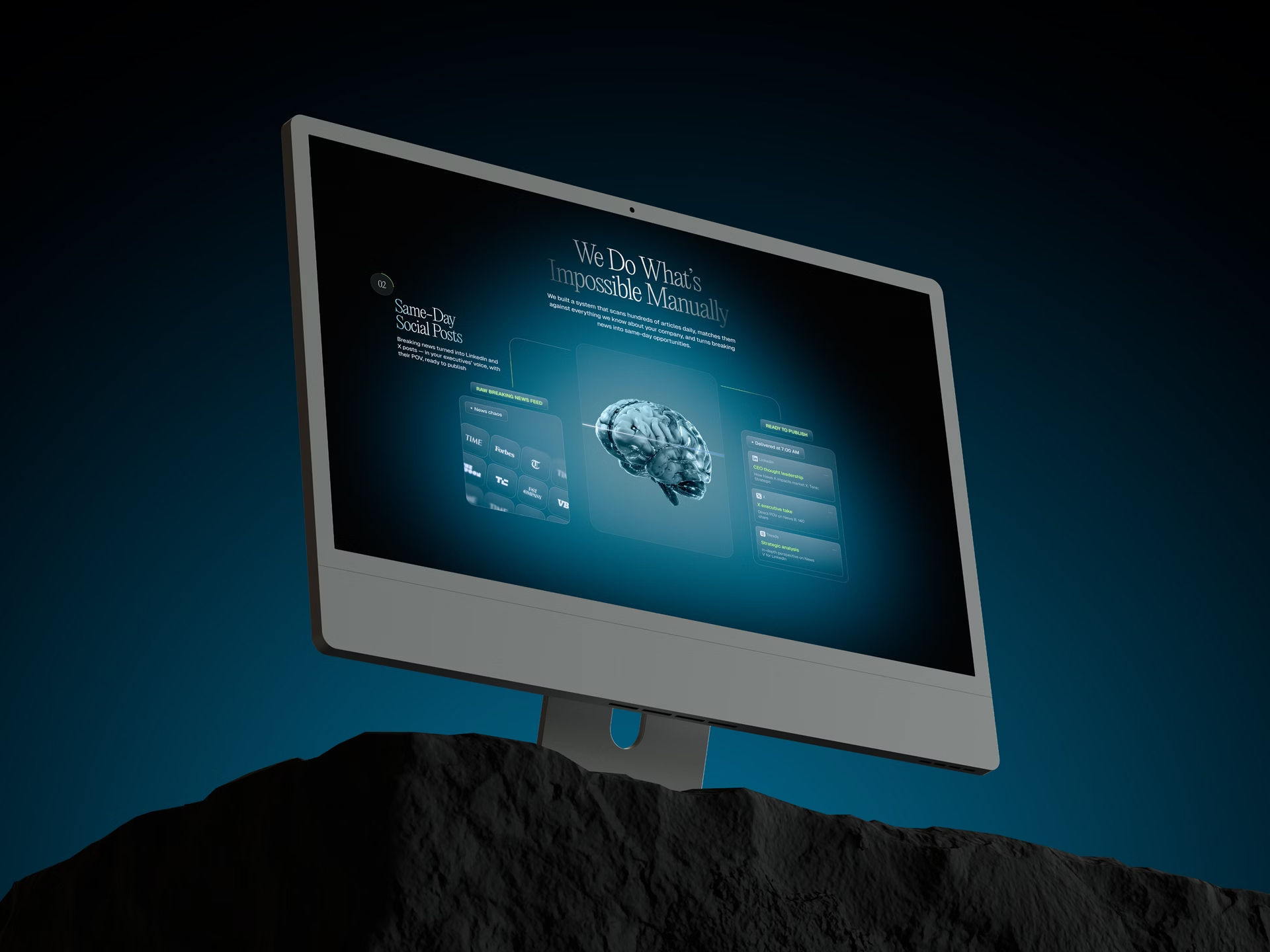
- A separate challenge came up on the Why Salient page: there was a section about how AI factors into the agency's work, packed with statistics. Just dropping in the numbers would have wrecked the light, "breathing" feel the team had built on the homepage. The fix didn't come right away. The section turned into an animation of a brain that changes state as you scroll, so the heavy information was delivered in doses instead of one dense block.
What We Ended Up With
The final homepage went out for approval and, as the team put it, "landed with zero revisions." Justin was thrilled, even though he'd given the team full creative freedom.
We're telling this story not because everything went smoothly. We're telling it because it's a good example of how we actually work: we're not afraid to revisit a project's goal midway through if there's a real reason to, and we don't fall apart when things take a 180-degree turn. Research doesn't get thrown out when the design changes. The first logic doesn't get erased when the goal changes. Everything done earlier becomes material for the next step.
The employer's heavy involvement in this project wasn't a source of chaos. It was a source of precision. Every decision went through real feedback, and came out stronger for it. The finished site, and the results, are waiting in the case study.
About Digital Butlers
We’re Digital Butlers — a design-led team of 27 senior specialists building digital products since 2016. By choosing us, you’re getting results that are way different from what you already have — with the same commitment to your goals that Alfred has for Batman.
If you need a website, web service, or mobile app that pays off, reach out to us — we do it well.
Digital Butlers — a mature team with mature processes that deliver consistent results.


Let’s discuss your next website.
My name is Alex, and I’ll help you define the right next step.