


Everkind Digital
How we helped Everkind Digital move from its old brand into a new digital system, migrate dozens of content pieces, run the entire process without a single call, and build a website that held up through a major round of changes even after development.


Everkind Digital is a specialized agency working with brands in the plant-based, vegan, and vegetarian space. The employer helps companies like these with promotion, communications, and content, from advertising support and copywriting to broader marketing work. The brand was previously known as Plant Based News (PBN), but by the time this project began, it had reached the point of a full rebrand, with a new name, updated positioning, and a fresh brand book.
At this stage, the employer didn’t just need a new website. They needed a full transition into a new digital system. As part of the project, we had to migrate a large amount of existing content, update the interface in line with the new Everkind Digital brand, replace outdated brand references, and build a stable architecture that could handle major changes even during implementation, without losing visual or technical consistency.
Rebranding as the Starting Point of the Project
This project didn’t begin with the idea of “refreshing the design.” It began with the company’s transition into a new identity.
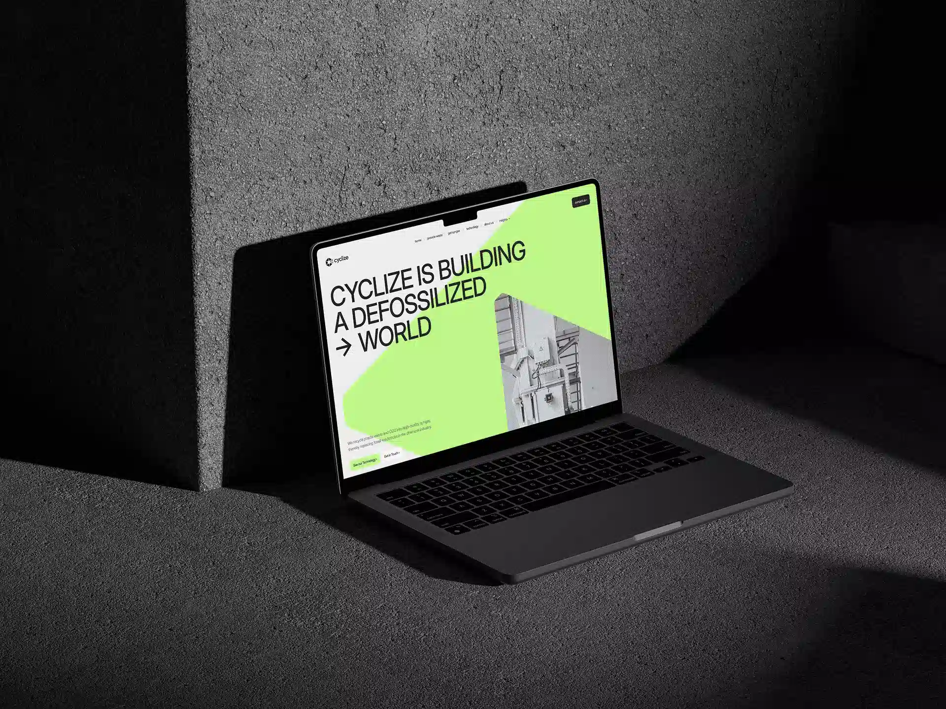
The old website was tightly tied to the previous Plant Based News brand, and you could feel that in everything: the visuals, the way information was presented, and the overall impression of the site. After the rebrand, Everkind had a new brand book, a new color system, and a new name. So the website had to stop feeling like an extension of the old version and become a полноценная part of the new brand.
In projects like this, it’s especially important not to stop at a superficial redesign. If you only replace the logo and colors, users will still read it as the old website in a new wrapper. So the task here went deeper: to rebuild the company’s digital presence so it genuinely matched this new stage of its development.
What the employer got: Everkind received a website that already works for the new brand, not for the legacy of Plant Based News. This wasn’t a cosmetic update. It was a full transition into a new digital system.
Migrating Content Without Losing the Existing Content Base
One of the most time-consuming parts of the project didn’t sit at the visual level, but inside the content structure.
The old site already had a large library of materials, including more than 69 articles. During the transition into the new brand, that content had to be preserved and moved into a new CMS structure. In practice, tasks like this are almost never solved with one click: even if the data can be transferred technically, manual refinement still starts afterward.
Some materials had to be checked after migration, and some had to be adapted to the new page structure. Another layer of work was tied to branding: across the entire website, old mentions of Plant Based News / PBN had to be replaced with Everkind Digital. It’s routine work, but also critically important, because that’s exactly what removes the feeling that “only the first screen got renamed.”
What the employer got: the employer preserved their existing content and moved it into a new system without the feeling that the website had to be rebuilt from scratch. The materials remained part of the product, but now inside the new brand and the new structure.
A New Visual Language: Modern, Clean, and Without Overload
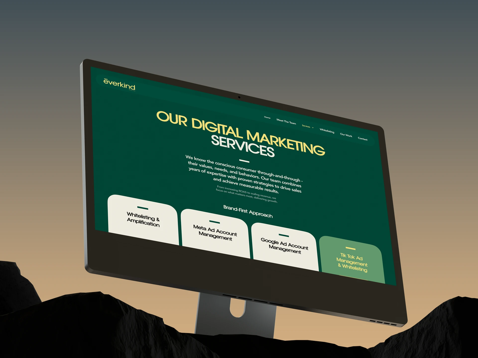
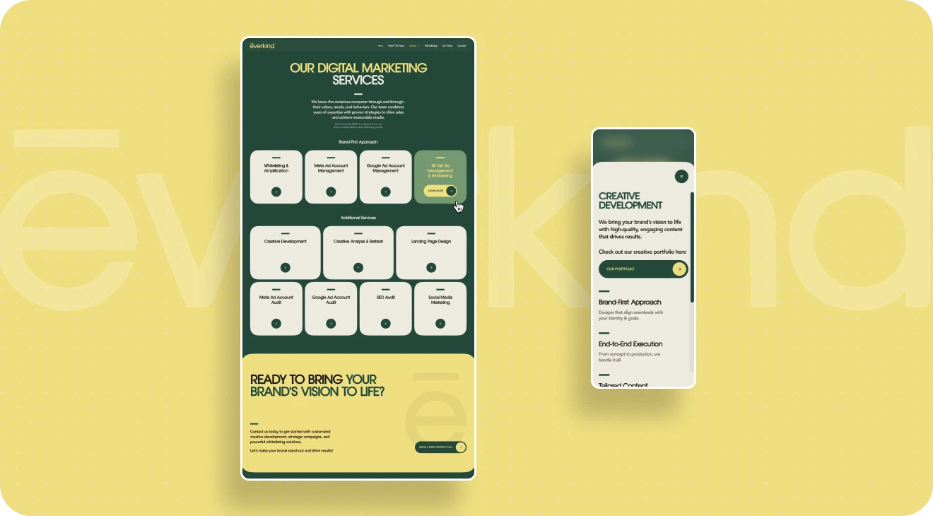
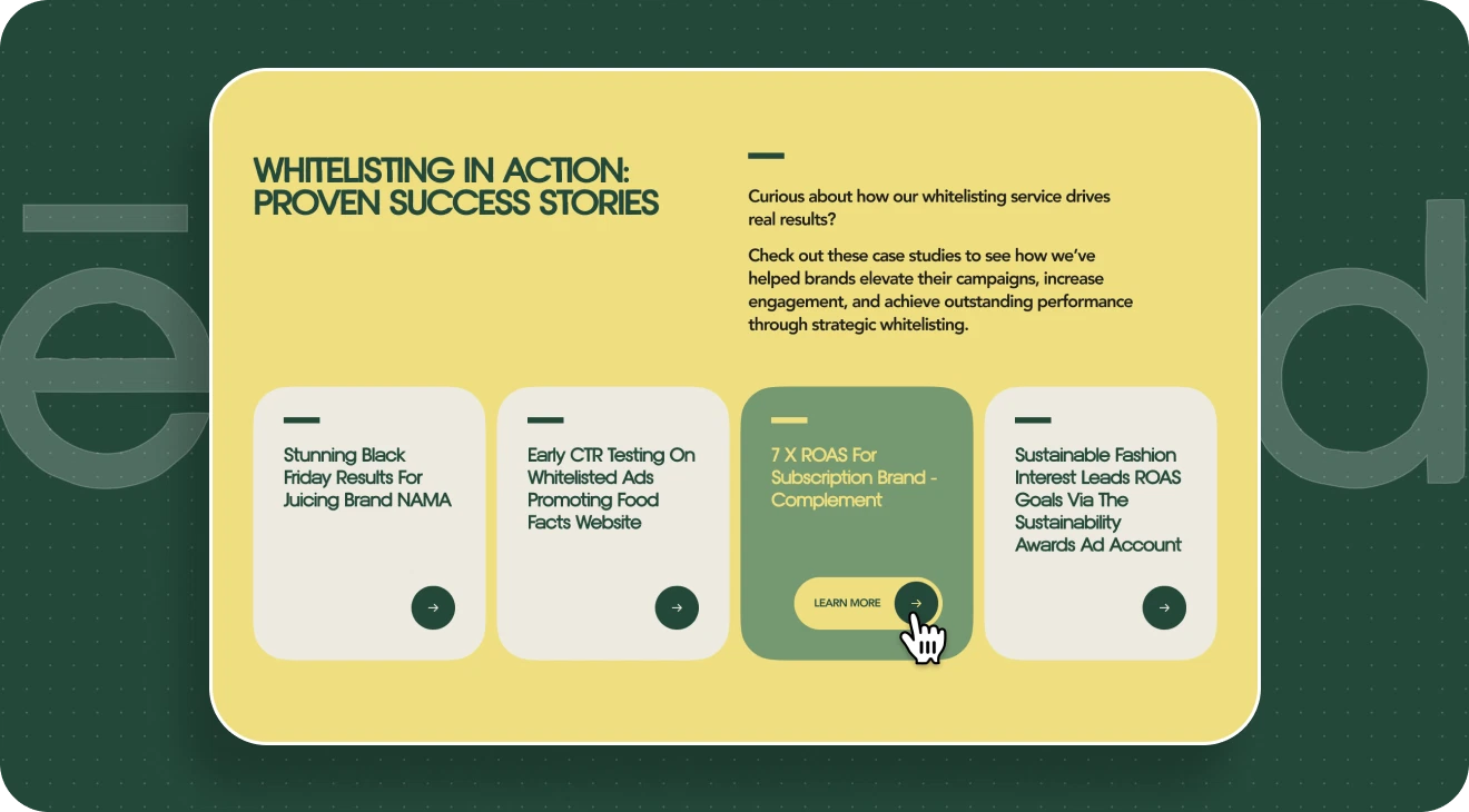
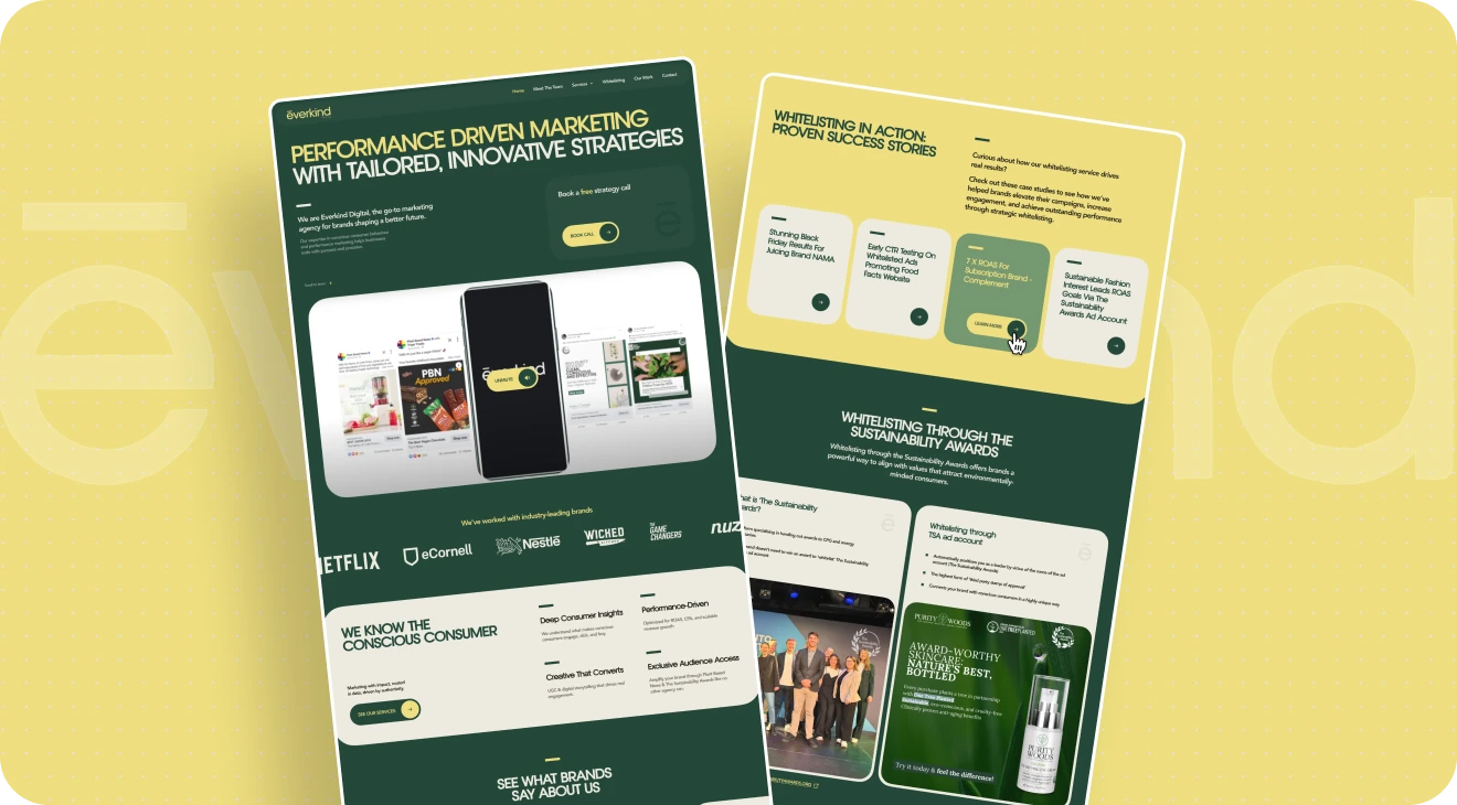
From a design perspective, Everkind was not a project in the “make something as experimental as possible” category. The task here was different: to create a modern, confident website that feels current without losing business clarity.
We relied on the employer’s new brand book and built the visual system around the updated palette, with rich green and yellow accents. That immediately gave the project a more lively, energetic, and noticeable feel compared to the old version.
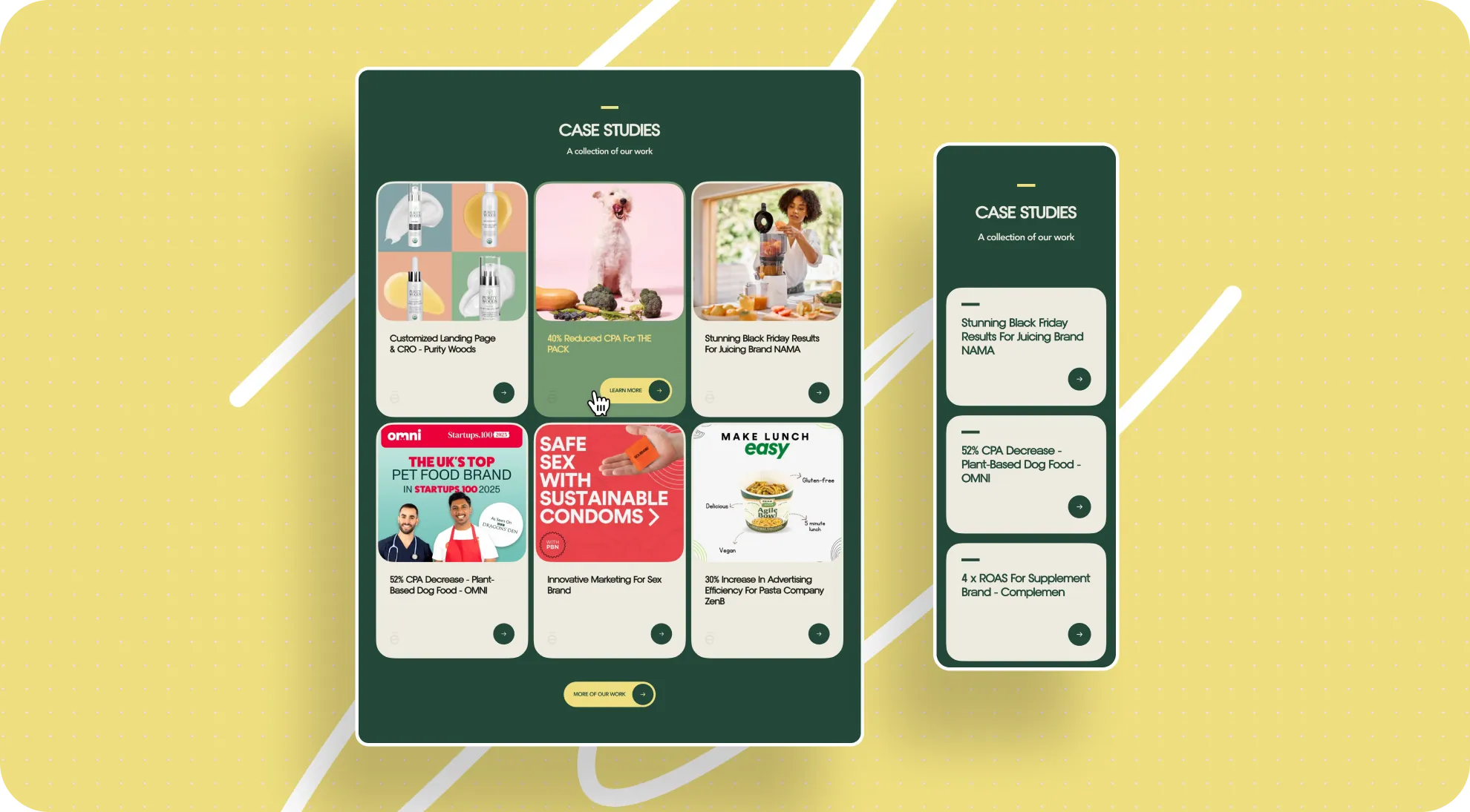
At the same time, we were careful not to overload the interface. What mattered more to us was achieving a different effect: making the site feel structured, easy to take in, and consistent across all pages. This was especially important in content-heavy sections, where the goal wasn’t just to lay out text neatly, but to make it easier to read. That’s why in a number of blocks, long chunks of information were reworked into cards, grouped structures, and more compact content compositions.
What the employer got: the website became more modern and more noticeable than the old version, but without unnecessary decoration. The new visual language strengthens the brand and makes information easier to absorb.
Animation That Doesn’t Pull Attention Away From the Content
Although the project didn’t call for a complex experimental setup, it still included a number of precise animation decisions that made the interface feel more alive and modern. From the start, we weren’t trying to turn the site into a showcase of effects for the sake of effects. The goal was to support Everkind Digital’s new visual language and give the website a sense of structure, rhythm, and subtle depth.
How We Reworked the Main Banner
One of the clearest examples was the main banner, built around the employer’s original image. On its own, the original asset wasn’t ideal in terms of quality, and in static form it worked in a fairly limited way: it was just a photo, and it didn’t give the site the level of expressiveness the first screen needed.
So in implementation, we went further than the source material. We separated the image into several layers, added extra visual elements to the composition, and introduced scroll-based behavior. As a result, the banner stopped reading like a standard static image and started working like a full part of the interface: more alive, deeper, and much stronger in the way it shaped the first impression of the site.
What matters here is that this wasn’t a “big show” on entry. It was a subtle enhancement. Users don’t read this kind of mechanic as a standalone special effect — they just feel that the screen is put together with care and looks modern
The Animation Logic Across the Entire Site
The rest of the animations followed the same logic. We used hover effects, smooth transitions between states, soft element reveals, and small movements on scroll — not to distract from the content, but to make interacting with the website feel more natural.
Details like these usually don’t stand out as separate “features,” but they shape the overall impression of the interface in a major way. When animation is handled carefully, the site feels more cohesive, more considered, and more current, without ever feeling overloaded.
When It’s Better to Simplify a Good Idea
The project also included a more noticeable interactive concept: a card animation built around the idea of stacked folders. On hover, a card seemed to slide out from the stack, and the solution itself looked quite expressive. From a design perspective, it was an interesting detail with character, one that added a nice sense of plasticity to the interface.
But at the employer’s request, that scenario was simplified in the end. For us, this is an important part of the process: we don’t just propose strong ideas, we also calmly adapt them to the kind of final digital image the brand wants to have. Sometimes the best result is not the one where every invented effect survives, but the one where the interface fits the employer’s expectations more precisely and works better in their context.
What the employer got: the site feels alive and current, but not overloaded. Animations and interactive details strengthen the impression of the brand without interfering with the content or competing with the interface’s main job.
How We Built the Process Without Constant Calls
The project moved mostly asynchronously: most communication around revisions and approvals happened without calls, through comments and documents. For Everkind, this was especially relevant because several people on the employer’s side were involved in the discussion, and the main point of contact wasn’t always able to join calls quickly — often communication happened literally on the go, in writing.
In a setup like this, it’s very easy to lose context: some revisions stay in messages, some in comments on layouts, some in verbal agreements, and then the team ends up spending time not on the work itself, but on reconstructing who meant what. To prevent that, we relied on a process that had already worked well for us on another large project and applied it here.
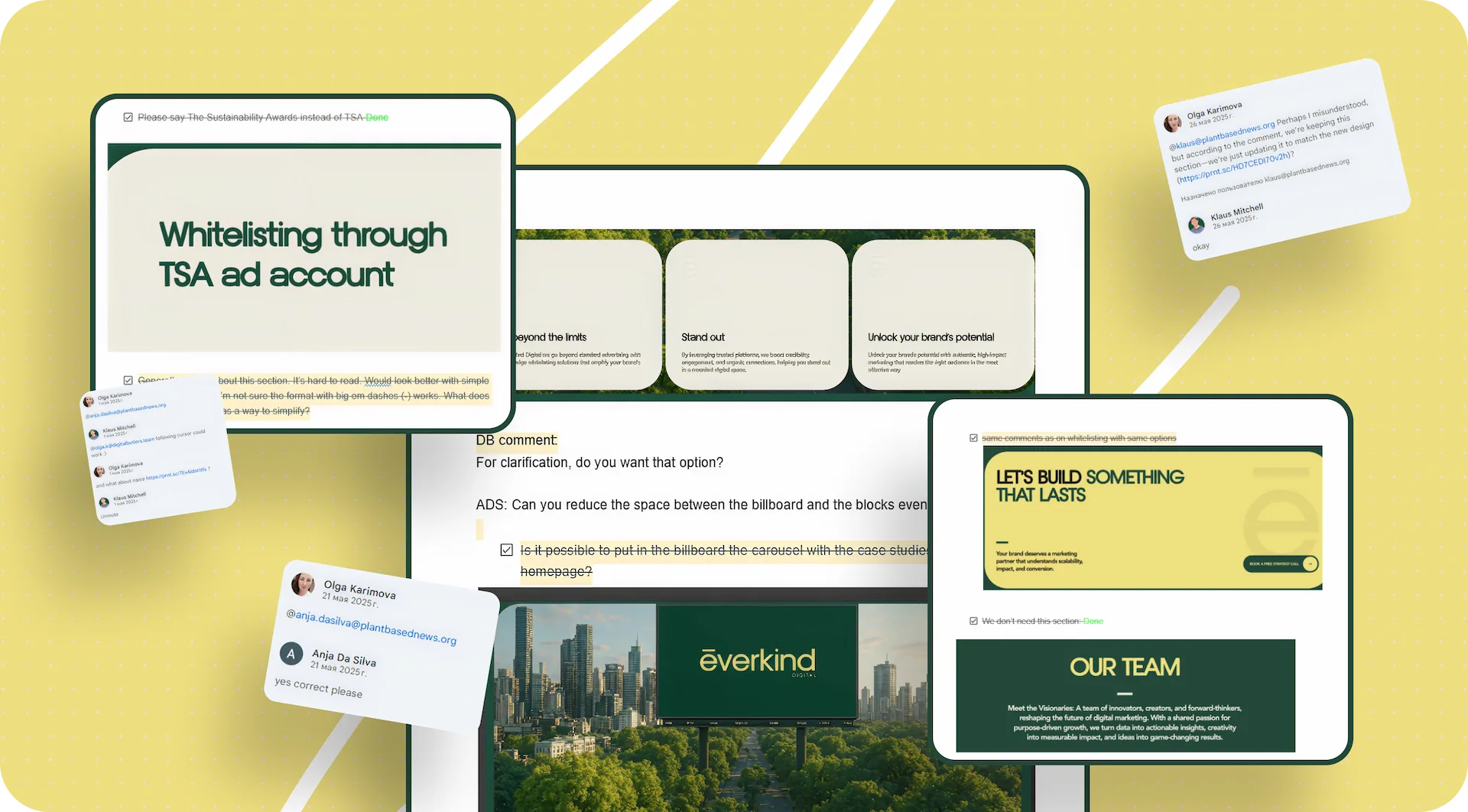
Google Doc as a Single Source of Revisions
Our main working tool was a shared Google Doc that both our team and the employer could access. We didn’t keep all comments in one long, continuous document. On the contrary, we broke it down by page. Each website page had its own separate section, and that immediately made the discussion much easier to follow.
If the employer had comments on a specific page, they went exactly where they belonged instead of getting lost in the general flow. This format works especially well on projects with a large number of screens: there’s no need to scroll through a long stream of comments just to find the right discussion block.
A Color-Coded Status System
On top of that, we used a simple but very convenient color-coded status system:
- green — everything is approved, no more revisions;
- blue — revisions have been made, now the employer’s side needs to review them;
- red — new comments or a new revision have appeared and need attention.
Because of that, the document worked not just as a list of comments, but as a living project map. You could open it and understand the current state in just a few seconds: which pages were already closed, where we were waiting for confirmation from the employer, and where new input had appeared.
The Link Between Design, Development, and Project History
This format turned out to be useful not only for design, but for development too. When changes were made after the main design phase had already been completed, we marked that separately in the document so the developer could quickly understand what had changed. In practice, the Google Doc also became a bridge between the layouts and the front end: the latest comments showed exactly what had changed, on which page, and in what context.
There was another practical advantage to this approach too: it preserved the project history. If a question came up later about why a specific decision had been made, the document kept the full logic of the approvals. That was useful not only in the moment, but afterward as well — when we needed to reconstruct the course of the project, check at what stage a certain version had been approved, or simply avoid starting old discussions from scratch again.
In essence, for Everkind this process became proof that even without constant calls, a project can still be run in a very structured way — if the team has a transparent system for handling feedback.
What the employer got: even without constant calls, the project remained transparent and manageable. Everyone involved could see the current status of pages and revisions, quickly understand where their input was needed, and keep the history of changes from getting lost across chats and comments.
A Scale That Had to Be Reconsidered After Development
One of the most revealing moments in the project came after the design had already been approved and the site had moved into implementation. At the layout stage, the scale looked correct: typography, spacing, and the overall composition raised no questions. But when the employer opened the already developed site on a device with a smaller screen, the perception was different.
The interface started to feel larger than it did in Figma. Headings, vertical spacing, and the overall density of the pages looked fine in the layout, but in the browser they created the impression of a website that felt too “big” — especially on the employer’s working laptop, where the project was actually being reviewed. Formally, this wasn’t a design error: the issue appeared at the intersection of the layout, the viewing environment, and user perception. But that’s exactly the kind of real-world moment that demands additional flexibility from the team.
Why This Became a Separate Challenge
The difficulty was that the comment didn’t appear at the beginning, but only after the project had already moved into development. So this wasn’t about a local revision to one screen, but about reconsidering scale across the entire site once the core visual decisions had already been made.
We had to go through several interface layers at once:
- reduce the size of some headings;
- revisit spacing between sections;
- make pages feel less airy where that influenced the perception of scale;
- bring blocks that felt too massive on a smaller screen into a more comfortable range.
Most of that rework landed on the front end. From a design standpoint, it didn’t cause serious problems, but at the implementation stage it was still a visible amount of work: in practice, the whole interface had to be carefully retuned for a different perception scenario without breaking the project’s visual system.
What This Revealed About the Project
Situations like this are a good test of how robust a project really is. If a website is assembled as a collection of disconnected decisions, any large-scale change after development turns into a long and expensive rebuild. But if the foundation is structured systematically from the start, even a major scale adjustment can be made without losing quality and without feeling like everything has to be redone from scratch.
That’s exactly what happened in Everkind. We had to seriously adjust how the interface was perceived after the build was already complete, but the project remained manageable and preserved its cohesion.
What the employer got: the interface was adapted not only to the approved layout, but also to real-world perception on the employer’s actual device. As a result, the site became more comfortable in everyday use, not just technically correct in the design file.
Why That Rework Stayed Manageable
The reason the scale adjustment didn’t turn into an endless rebuild was the project’s systematic assembly.
At the design level, we worked through:
- Tokens;
- Components;
- auto layout.
That made it possible to introduce changes not as edits to a set of separate pictures, but as changes to a connected system.
At the front-end level, relative units were used, specifically rem, as well as clamp for more flexible size adaptation across different resolutions. Because of that, the interface scale could be adjusted centrally instead of manually editing dozens of blocks one by one.
For the employer, details like these usually stay “under the hood,” but they are exactly what determines how calmly a project can survive real changes after the layout stage.
What the employer got: even after a major size adjustment, the site kept its integrity. The changes were made quickly and carefully, without the feeling that the project had to be rebuilt from scratch.
Results for Everkind Digital
After launch, Everkind received:
- a website in the new brand, visually disconnected from the old Plant Based News system;
- a modern interface built around the new brand book;
- a migrated body of content, including more than 69 articles;
- an updated page structure and cleaner presentation of materials;
- subtle animation and interactive elements that make the website feel more alive;
- a working CMS structure with updated brand entities;
- a project architecture that held up through major scale revisions even after development.
The employer can now:
- present the company to the market as Everkind Digital, not as an extension of PBN;
- use the site as an up-to-date digital brand touchpoint;
- preserve and use the existing content after the rebrand;
- continue developing the site without feeling like it was built in a fragile way that won’t survive future changes.
Conclusion
At the core of this project was a task that often looks simpler than it really is in practice: moving a brand from one identity into another without losing either the accumulated content or the sense of cohesion. For Everkind Digital, that meant not simply updating the visual layer, but building a new digital system capable of reflecting the brand accurately at its new stage of development.
That’s why the foundation of the project wasn’t one successful visual idea, but systematic work across every level: from the brand transition and content structure to the approval process and technical implementation. This approach made it possible not only to build the site in line with the new Everkind Digital brand, but also to move through a serious post-development scale adjustment without losing quality and without the feeling that the whole project had to be rebuilt.
For us, this is one of those cases that clearly shows the value of a well-thought-out system. When design, content, communication, and front end are all connected, even a complex project with a large number of inputs stays manageable. And that is what the employer ultimately gets: not just a new website, but a stable digital tool that fits the brand’s current stage and is ready for its future growth.
Awards
About Digital Butlers
We’re Digital Butlers — a design-led team of 27 senior specialists building digital products since 2016. By choosing us, you’re getting results that are way different from what you already have — with the same commitment to your goals that Alfred has for Batman.
If you need a website, web service, or mobile app that pays off, reach out to us — we do it well.
Digital Butlers — a mature team with mature processes that deliver consistent results.


Let's discuss your project.
My name is Alex and I am your potential Digital Butler


.webp)