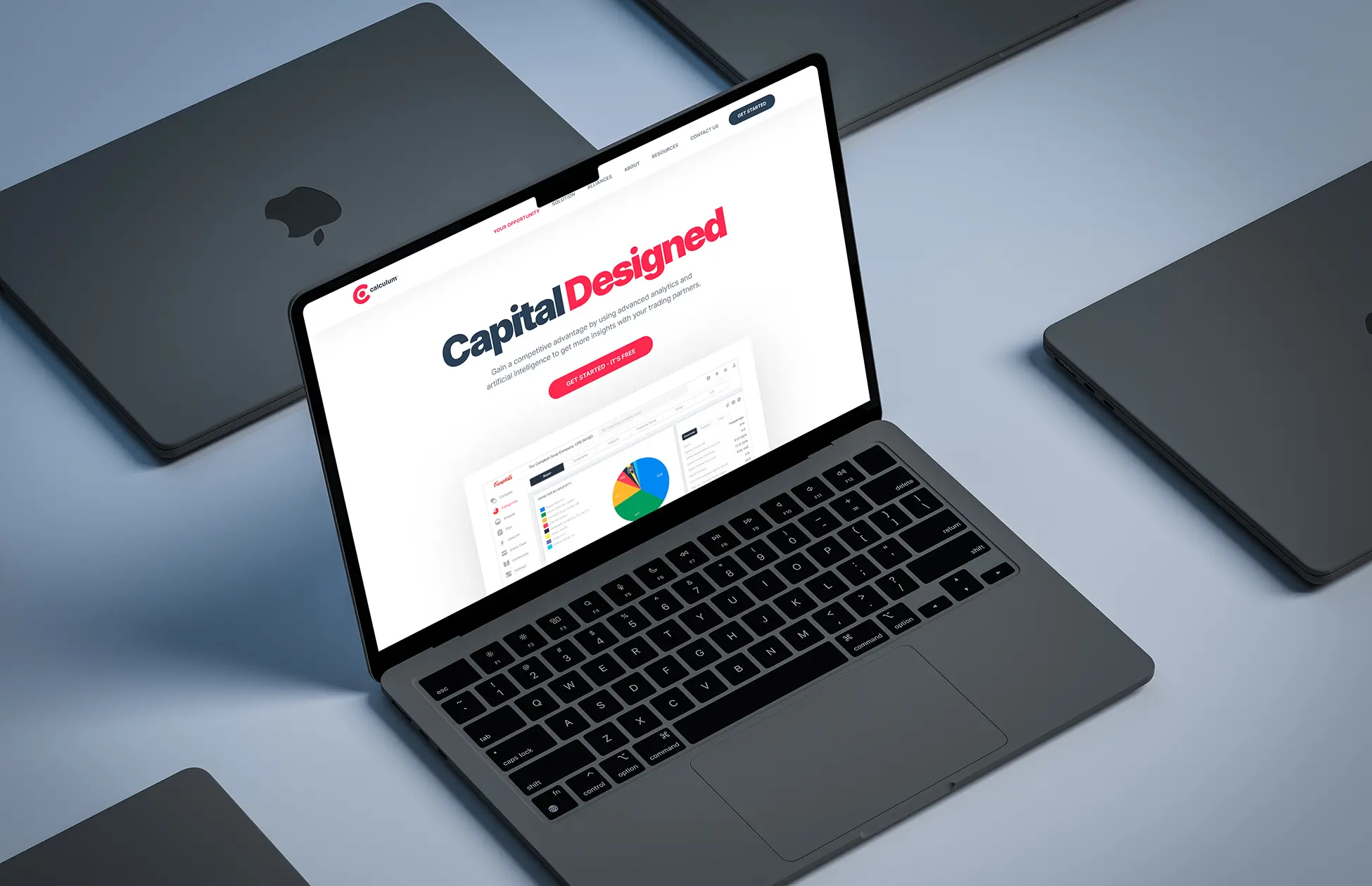
Vitable Health
A two part Webflow story: from a flashy 3D marketing site with calculators and an interactive U.S. map to a calmer, research aligned employer focused product rebuilt in 2 weeks — preserving key functionality, fixing launch risks, and sharpening how we set priorities with every new employer.




Vitable Health is a U.S. healthtech service and primary care provider for employees of companies across the United States. Their model combines several things into one product: a medical “subscription” instead of traditional insurance, telemedicine via an app, lab work both in clinics and with providers coming to your home, plus mental health support. For employees and their families, this means access to more than 1000 free prescriptions and tests with no copays or deductibles. For employers, it’s a clear tool for taking care of their team’s health and reducing the costs of traditional insurance.
Vitable’s core product is digital: people sign up for services and talk to doctors in the app. Within this ecosystem, the website acts as a storefront and an “explainer”: it helps visitors understand what this service is, how it works, and why it’s a good deal for employers.
Over the course of working with Vitable, we’ve done two major projects. The first time around, the employer came with prototypes and basic brand identity, and we built a striking 3D Webflow site from scratch, complete with calculators and an interactive map of the U.S.
The second time, Vitable came back after a full‑on rebrand, with a new brand and agency layouts, and asked us to completely rebuild the site in about 2 weeks to match the updated style, make it easier for real users, and keep all existing functionality intact.
Between those two points is our own mistake with priorities and a very important lesson that now shapes every project we do. But let’s take it step by step.
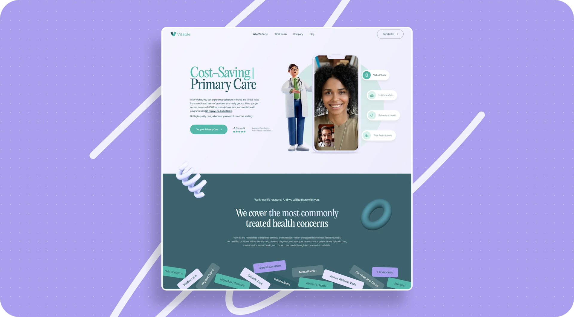
Vitable 1.0: a striking 3D site from scratch
The first time Vitable came to us, they had a clear request: they needed a new site that would explain the product and at the same time highlight how technological it is. On the employer’s side, they already had detailed page‑by‑page Figma prototypes with copy, a logo and basic color palette, a brand book, app screenshots, and static 3D renders of doctor characters.
Initially, the plan was just to design the user interface based on those prototypes. Once the design was approved, the scope expanded: we took on full website development in Webflow. This included modeling and integrating 3D objects, building two calculators, creating an interactive U.S. map, and setting up the CMS structure.
The main goal seemed obvious: the site had to clearly explain how the medical subscription works, show telemedicine and in‑home visits “in action,” underline how innovative the product is, and still stay fast and accessible in terms of performance and responsiveness.
How we searched for the visual language
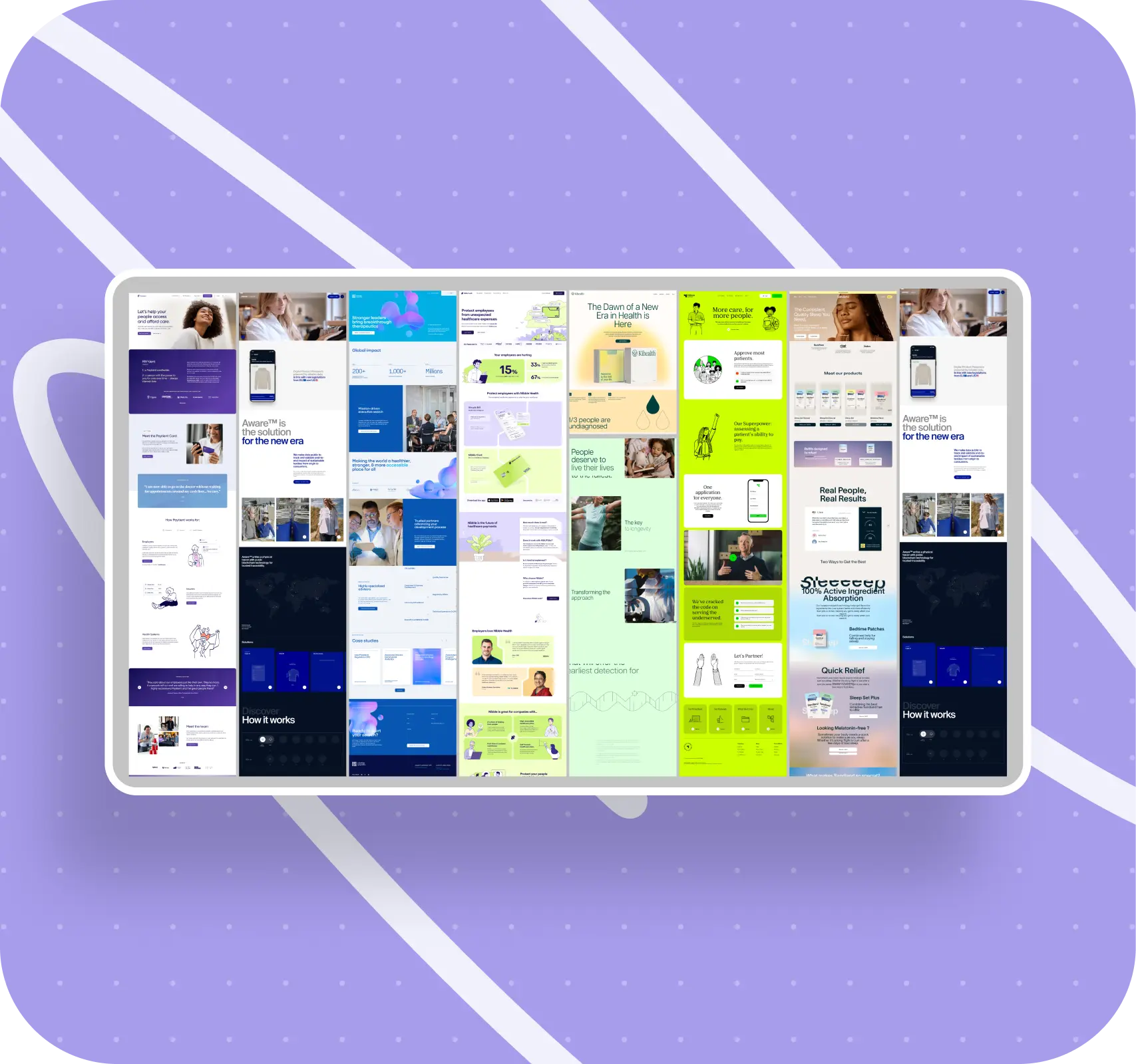
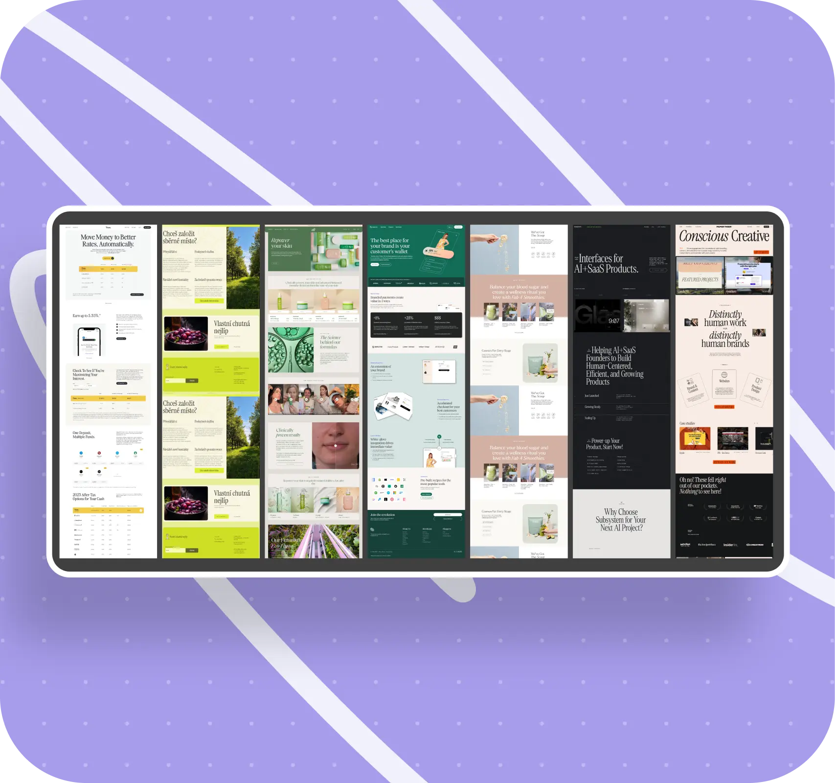
Before diving into detailed interface design, we synced with the employer on the visual direction. The Vitable team shared sites they liked. We brought our own references that felt right for a medical service with a tech core.
After trading opinions, we put together a mood board: we decided which colors and typefaces felt both lively and professional, which shapes and animations suited the product, and which might get in the way of clarity. We also drafted a “do / don’t” table for ourselves and the employer — a set of rules for what we allow on the site and what we explicitly avoid.
That helped us sidestep the classic situation where, several iterations in, it turns out we and the client had very different ideas of what “modern” and “techy” look like.
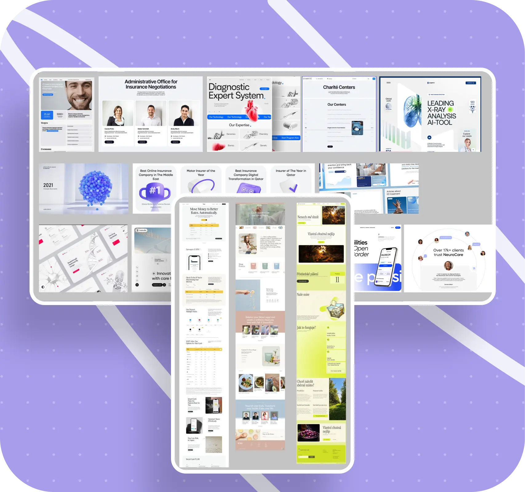
How to show telemedicine and the “human side” of the service
Because Vitable is heavily built on telemedicine, it was important not just to mention that in the copy, but to visualize it and make this aspect clear for someone far from the healthtech world. This is where the static 3D doctor renders came in handy.
We carefully embedded these characters into real stock photos selected for Vitable’s target audience. In one block, a doctor appears in a smartphone screen; in another, they look like they’re standing next to someone at home. This grounds the digital service in familiar everyday situations and stops it from feeling like some abstract app floating in the cloud.
To reinforce the medical feel, we paired clean sans‑serif and serif typefaces in headings, and extended the base palette with soft pink and green tones. The interface ended up friendly, but with an unmistakable association with healthcare and care.
.webp)
.webp)
.webp)
3D objects, interactivity, and storytelling
Another key task was emphasizing how innovative the product is. To do that, we actively used 3D objects that gently rotated and shifted across different sections of the site. They weren’t just background decoration: each object visually supported the meaning of the block, reinforcing what the copy was saying.
We deliberately avoided chaotic “3D‑for‑the‑sake‑of‑3D.” Instead, we focused on interactive scenarios that help tell a story. Several such patterns appeared on the site.
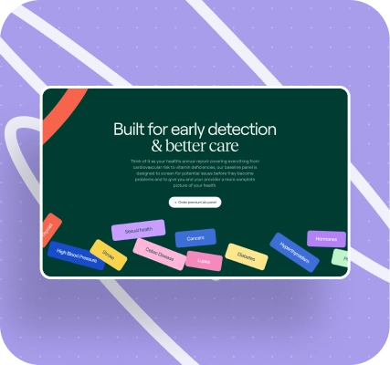
One of the most memorable blocks is the second screen of the homepage. In it, we talk about health problems people face throughout their lives, and we visualize those problems as “bricks” with tags falling from above.
Users see these labeled tiles literally “fall from the sky,” collide, bounce off one another, act like pinball elements. You can toss them around, drag them, observe the physics — a dry list of pain points turns into a vivid, interactive experience.
Another pattern we particularly liked was built around moving from problem to solution. On horizontal scroll, a negative entity gradually turns into a positive one: the background changes, 3D objects transform, and the user literally “scrolls through” the path from challenges to resolution. We reused this technique across several sections in a row, and the Vitable team responded very positively to it.
Other 3D elements were “scattered” around the pages: background shapes, smooth text animations, changing block states on scroll. The visuals never felt completely static; the site felt alive and dynamic. We used Figma for design and prototyping. The 3D models were created and optimized in Blender, and some of the animations and video assets were produced in Adobe After Effects.
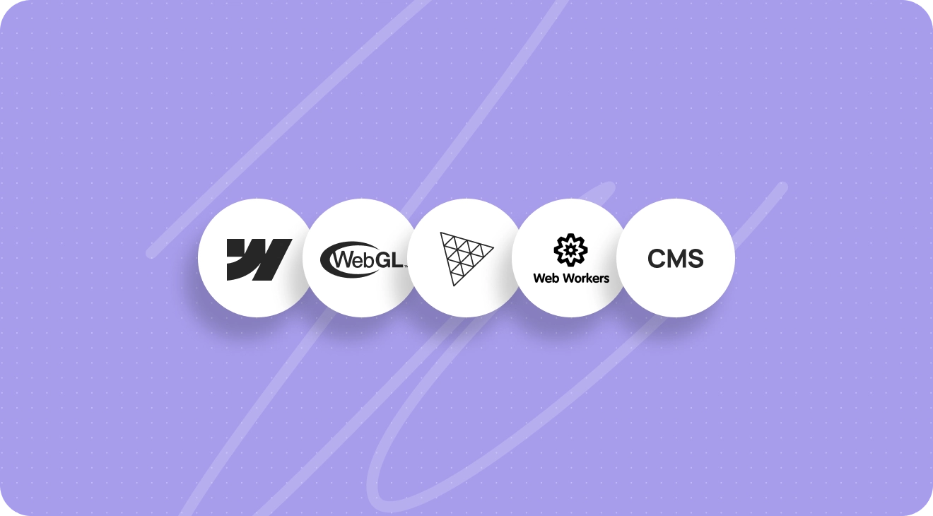
We built the site itself in Webflow, extending it with custom HTML, CSS, and JS whenever the platform’s default capabilities fell short. For integrating 3D objects, we used WebGL and the Three.js library. To keep heavy rendering logic from blocking the interface, we used Web Workers to move resource‑intensive operations into a separate thread.
Thanks to this architecture, we kept page load times at about 1–2 seconds, even with 3D graphics, scripts, and animations.
Calculators, the U.S. map, and the CMS structure
Once the design was done, we handed the Figma file over to development. The frontend team built the base page structure in Webflow, adapted it for different screen sizes, and then wired up animations, the CMS, and interactive blocks. In parallel, the 3D specialist modeled and optimized objects for integration.
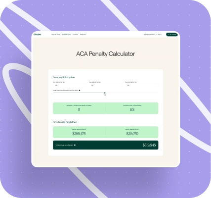
The site ended up with two calculators. The first one calculated savings for the employer: it showed how much a company could save on health insurance by using Vitable. The second one helped estimate a potential ACA penalty if the employer didn’t meet statutory requirements. Both calculators ran on the frontend with custom calculation logic and smooth number animations, so the values wouldn’t “jump” abruptly.
The interactive U.S. map deserves a special mention. It showed the states where Virtual & In‑Home Care is available, regions where only telemedicine is offered for now, and regions Vitable planned to expand into next. All the logic for this map was wired into Webflow CMS: you could manage state statuses and labels through the admin interface without touching code.
The CMS structure itself turned out to be quite extensive. We wired in a blog and case studies, testimonials, a leadership and investor list, the privacy policy and terms of use, a medical plan comparison table, and a FAQ section. This let the Vitable team manage the site as a full‑fledged information hub without having to involve developers for every edit.
.webp)
.webp)
.webp)
The technical level and architecture of Vitable 1.0
- Platform and content: the site structure and content management were implemented in Webflow, with no separate backend.
- Visuals and animation: complex animations and interactive elements were built on top of WebGL and Three.js.
- Performance: heavy 3D‑related operations were offloaded to Web Workers to avoid blocking the main thread and degrading load times.
- Interface and styles: the interface was assembled from a carefully designed system of styles and components in Webflow; wherever the platform’s standard functionality wasn’t enough, we used custom HTML, CSS, and JS.
What the employer got: in this first case, they got an ultra‑fast, highly technical website that didn’t just look flashy, but also provided a useful toolkit — calculators for demonstrating savings, an interactive U.S. coverage map, and a flexible CMS structure for managing content independently.
What the first version taught us — and how current projects benefit
Product companies almost never have a single perfectly formulated problem. More often, several issues surface at once. Users complain that they can’t quickly figure out how things work. Conversion quietly dips. Partners suggest updating the brand and positioning. Each task sounds reasonable on its own, but together they blur the core question: where do we start, and what actually matters most?
Our first time working with Vitable, we were acting like a fairly typical studio of that era. We sent straightforward proposals, leaned heavily on whatever the employer brought us, and did very little of our own UX research. We didn’t interview users, didn’t validate hypotheses with quantitative data, and didn’t stress‑test the initial problem statements.
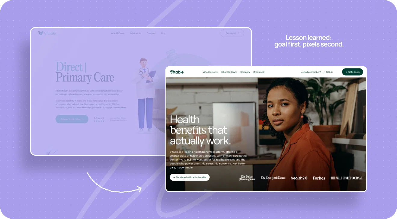
Vitable came to us with two seemingly clear problems: the site looked outdated and was confusing to navigate, which hurt conversion. No one remembers exactly how we prioritized back then, but in practice we decided that updating the visuals was more important. The copy was already there; it felt like clarity would “tag along” once the interface became modern and impressive.
We focused on the “pretty part” — and we actually did that part very well. The new site looked sleek, fresh, and techy. But it wasn’t really speaking to the right people or in the right language.
Vitable’s real audience isn’t tech enthusiasts or early adopters. It’s regular working adults, HR professionals, and business owners. They need a simple, human explanation of what the service does and how it helps their employees.
For a portion of that audience, our glossy, 3D‑heavy interface felt overwhelming, and the structure wasn’t always obvious. In healthcare — especially in B2B communication with employers — speed and clarity of the path matter more than flashy or complex animations.
A year later, Vitable came back to us. But this time it wasn’t for design; it was for frontend development of a layout created by another contractor — branding agency Serious Business.
One of the first questions that team asked the employer was this: of the two goals — update the visual look or make the site simpler and clearer — which is truly the main one? They built the entire design around the second goal. Visuals became a tool for clarity, not an end in themselves. That one question changed everything.
For us, this story was a wake‑up call. We realized we could execute a solution perfectly, but if we picked the wrong primary problem at the outset, the business result would be mixed at best. From then on, we adopted a rule: before touching a single pixel, we have to fully clarify the core objective. We separately ask what’s truly more important right now — solving a business problem, closing a communication gap, or adjusting brand perception.
For the employers we work with today, this means a more honest and effective starting point: instead of spending months polishing “the wrong” problem, we focus from the beginning on what actually affects conversion, trust, and product comprehension.
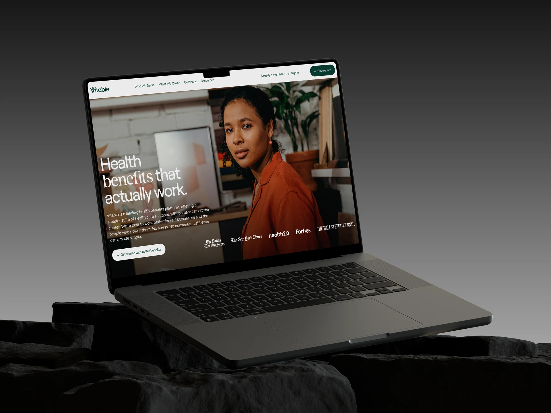
Vitable 2.0: rebuilding under a new brand in 2 weeks
After the first version of the site, the employer decided to take a more systematic approach to the brand and product. Vitable brought in Serious Business, who ran audience research, worked on strategy, developed a full visual identity, and reworked the site structure. They produced new copy built around a clear narrative — including dedicated messaging for employers who buy benefit packages for their teams.
On the second round, Vitable came to us with a very different set of inputs. Instead of “we have a logo and a general idea,” we got Figma layouts with desktop and partially mobile designs, animation annotations, a new structure, and final copy for each block. The request was very specific: build the new site on top of this design as quickly as possible, make it simpler and clearer for users, and don’t break existing functionality — calculators, forms, subscriptions, and employer‑critical animations.
In essence, this wasn’t about creating a whole new product from scratch, but about careful evolution. We needed to move from a striking but more complex interface to a calmer, more corporate one, while preserving all working user flows. In terms of net‑new UX decisions, our role in the second version was minimal: the employer and agency defined the structure, copy, and priorities.
Our job was to translate all of that into Webflow with precision, flesh out and adapt the parts where layouts weren’t fully defined, and properly migrate functionality from the first version into the new shell.
Project challenges and the solutions they led us to
A brutal deadline and working in two shifts
By the time Vitable brought us the materials for version 2.0, they were already behind their desired launch date. The site was needed “yesterday” — partly for investor communications. Internally, we estimated development at roughly 200+ hours. We had about 2 weeks to do it.
One developer alone couldn’t realistically handle that volume in time. So we decided to run the project with two developers working in shifts. At the same time, Webflow itself doesn’t really support full parallel work by two people on the same project. Without rules around who edits what and when, it’s very easy to lose changes or overwrite each other’s work.
To avoid that, we set up a shift‑based process. Sergey worked days and shifted his schedule earlier so the night shift would have enough runway. Kolya came in evenings and nights. At shift handoffs, they hopped on calls to discuss what had been done, which pages and sections to take next, and where it was important not to overwrite each other. In practice, two people were working on the same project, but almost never inside it at the same time — always “one after the other.”
Ideally, in this kind of setup it’s better to break tasks down by sections rather than “whole pages,” with clear ownership. That way, even if the second developer finishes a block someone else started, it’s clear who does final review. In Vitable 2.0, the tight deadline and
Webflow’s constraints mostly forced us into a page‑by‑page “follow the leader” mode, but the idea of finer‑grained task decomposition stayed with us as a recommendation for the future.
How we worked with the agency’s layouts
The Serious Business design came with its own nuances. There were a lot of Figma layouts, and the file structure wasn’t exactly straightforward. To make navigation easier, we agreed with the designers to create a dedicated tab for us where they’d place pages that were ready for development. Some screens were marked with green dots — a signal that they were fair game to start building.
Of course, designs continued to evolve. Some pages were rethought along the way, and for certain screens mobile versions weren’t ready when we needed them. Once the pages marked “ready” ran out, we worked with the project manager to go through neighboring tabs and pull in pages that were already well enough defined to start development.
We handled some of the mobile versions ourselves — in line with the new brand and with an eye on already approved patterns. We regularly checked in with the employer to make sure they were comfortable with these decisions. In post‑project calls and retros, it became clear: without that flexibility in working with layouts and without switching to a two‑shift mode, hitting the deadline would have been almost impossible.
Webflow instability and how we handled it
Another source of stress came from Webflow itself. Both Sergey and Kolya described the same pattern: at first, there were rare, barely noticeable incidents where changes would unexpectedly disappear, and then we hit a stretch where the platform was unstable almost every night.
The pattern looked like this. A developer works for several hours, makes changes, publishes the site — the published version shows everything correctly. Then, for some reason, they re‑enter the editor (or the page refreshes), and suddenly those changes are gone from the working environment. If you publish again at that moment, the new version overwrites even the one that still had the changes.
By morning, sometimes only 20–30% of the night’s work “survived.” In theory, Webflow backups should save you in situations like this. In practice, rolling back to an earlier state did restore the missing chunk, but it also wiped everything done after that backup point. When this happens several times a night, you’re fighting not just the task, but the tool itself.
The developers tried to localize the issue. They contacted Webflow support, disabled browser plugins as recommended, switched to private browsing mode, checked whether VPN might be a factor. Sergey also paid close attention to the little green save icon in the editor: when it stopped glowing, that was his signal the system might not be saving further changes. At that point, he’d restart the editor and wait for the indicator to go back to normal.
Later, Webflow officially acknowledged that they’d had widespread outages and sent out an email describing the issue and promising a fix. We forwarded those emails to the employer so they’d have a formal explanation ready in case investors asked why certain parts of the work slipped past the original timeline.
Internally, we adopted a small “hack”: manually creating backups as often as possible — roughly every 10 minutes. It only takes a few seconds, but it requires constant self‑monitoring. As Kolya put it, to really do this right you’d almost need to set a timer for every 10 minutes and live by that, not by the task flow. Even so, despite the work lost to
Webflow bugs, we managed to bring the project to a state that satisfied the employer’s timing needs.
The launch mistake and a new production process
Right at the final stretch of the project, we had a working‑level incident that reshaped our internal launch rules. In Webflow, every project has two important branches: a test domain on yourproject.webflow.io, which you actively use during development, and a production branch with the employer’s custom domain, which real users see.
Throughout development, we were connecting and testing custom code and interactive pieces on the test domain. For those same scripts to run on the production domain, they also had to be explicitly published to the production branch. Because some pages were still being worked on and there was no clear signal that the employer was about to flip the domain, we didn’t do that step in time.
As a result, the employer independently switched the domain to the new version of the site, saw that some functional blocks weren’t working, and had to roll back to the first version. It was an uncomfortable situation, but a very instructive one.
After the retrospective, we set a simple rule: when handing a project over to the employer’s account, all custom scripts must be published to the production branch as well, even if some pages are still in progress. That way, the employer can switch the domain at any moment without risking a “half‑working” site.
What the employer got: in this second case, they ended up not only with a visually aligned new site, but also with a more reliable launch process — even if the team flips the domain on their own, they’re protected from surprises like unconnected scripts and broken functionality.
Migrating functionality: the calculator and “falling” tiles
From a development perspective, Vitable 2.0 wasn’t a brand‑new product, but a full rebuild under a new design. All of the functionality we built into 1.0 stayed conceptually the same. The main goal was to carefully migrate and adapt it, not reinvent everything.
The savings calculator: same logic, new shell
The calculator the employer used to demonstrate the value of their services first appeared in version one. On one screen, the user entered initial data — amounts, percentages, parameters. Then they went to a more detailed calculator where these values were automatically pre‑filled and used in the calculations. We kept this exact flow in version two.
Visually, the calculator became more compact, but under the hood it still relied on custom scripts: calculation logic was implemented separately from the smooth number animation, so those two wouldn’t interfere and numbers wouldn’t flicker or jump. Back then, the employer was already considering possibly moving back to a larger calculator later, and we intentionally kept that option open in the architecture.
The “falling tiles” interactive block
The second key element was an interactive block with falling tiles and coins. In the first version, this was a stand‑out, memorable section: elements with labels fell from the top, collided, spun “windmills,” and users could drag them around with the mouse. Initially, all the content for this animation was hard‑coded: labels, colors, copy. Every time the employer needed a change, they had to call in the developers.
We already knew that setup wasn’t ideal. On another project, Kolya had tested an approach where the animation data lived in a Webflow CMS collection. For Vitable, we adapted the same mechanic. In essence, the employer adds a new image and text into a collection, and a custom script on top of it generates a full‑fledged “physical” tile in the animation. In Kolya’s experience, using this interface was “pretty convenient”: changing the set of falling blocks no longer required touching code.
Configuring the interactive through the CMS in version two
In the second version, we completely reworked the visual design of this block for the new brand, but kept the mechanic. For the employer, that meant that even after a major redesign, they could still configure this fairly complex interactive piece on their own through the CMS interface.
Results for Vitable
Here’s what Vitable ultimately gained from the two iterations:
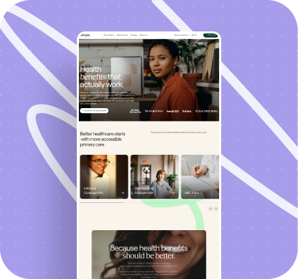
- a site aligned with the new, more mature brand and research findings: instead of an impressive but polarizing 3D show for part of the audience, a calm, structured corporate resource oriented toward a B2B employer audience and a straightforward explanation of the service’s value;
- preserved functionality from the first version — the savings calculator and the “falling tiles” interactive block — carefully moved into a new shell, with animation control through the CMS made more convenient and transparent for the employer;
- launch under very tight timing — roughly 2 weeks and about 200+ hours of two‑shift development, despite serious issues on Webflow’s side, plus official emails from the platform confirming that some timeline issues were indeed caused by service instability;
- a more reliable handoff and launch process: mandatory publication of custom code to the production branch and explicit communication around domain‑switch plans, to avoid shipping “half‑working” versions of the site.
Now the employer сan:
- rely on the site as a cohesive storefront for the service and brand, rather than just a flashy 3D show;
- confidently present the product to investors and partners, knowing that functional blocks and flows behave consistently;
- keep evolving — from a first version built almost “out of nothing,” with bright 3D and complex interactivity, toward a product grounded in strategy and research, focused not on wow‑effect for its own sake, but on simplicity, trust, and a clear path to the desired action.
Finally, for both us and Vitable, this story became a case about evolution rather than just a redesign. The first version showed what a healthtech site built almost from scratch can look like — with vivid 3D, complex interactivity, and a fast architecture.
The second showed what the same product looks like once the brand has a strategy, research, and a clear understanding of what really matters to the audience: not wow‑effect as an end in itself, but simplicity, trust, and a clear path to action.
Project scope
Vitable Health is an enhanced Primary Care membership that makes it easy for US-based employees to get high-quality care. Delightful in-home and virtual visits from a dedicated team of providers. Vitable Health provides access to over 1,000 free prescriptions, labs, and a mental health program for employees and their families with no copays or deductibles.
Initially, Vitable Health approached us to design the user interface for their new website based on prepared prototypes. After successfully completing the design stage, the scope of the project expanded to include full development of the site on Webflow. This involved modeling and integrating 3D objects, programming calculators, and creating an interactive map of the USA.
The employer provided detailed prototypes of each page with text in Figma, as well as the company's brand book, Vitable app screenshots, and static renderings of doctor characters that we could incorporate into the design.

Solution
In order to start the design process, we needed to align on the stylistic direction for the interface design. The employer shared some websites that the Vitable team liked, and we also put together our own list of references that we believed were suitable from a design standpoint. After receiving feedback from the employer, we created a mood board for colors, fonts, shapes, and animations. We also developed a "do and don't" table, which served as a clear guideline for the design solutions that could and could not be used on the site.

Given that Vitable Health's Primary Health Care subscription relied on telemedicine, it was crucial to showcase this aspect on the website. This was achieved by incorporating static renderings of doctor characters seamlessly embedded in real stock photos relevant to the project's target audience. Additionally, as the company also offers home visits in its range of services, this solution aligns perfectly with Vitable's approach.


To reinforce the medical theme, the site utilized clean serif fonts for headings, as well as pastel pinks and shades of green to complement the company's branding.
Furthermore, to emphasize Vitable's innovative health insurance and services solution, we integrated 3D objects that rotated smoothly across various sections and were used to reinforce the meaning of certain blocks described in the text. The site also featured interactive animations with horizontal scrolling effects, background color changes, physics-based simulations, and text animations.

One of the most beloved blocks in terms of meaning, according to our team, is the second block of the main page. It addresses the health problems that individuals encounter throughout their lives, portraying these issues as unexpected bricks falling from the sky. This interactive section allows users to play around with the tags by tossing them in the air or dragging them.

We also appreciated the approach of transforming a negative concept (problem) into a positive one (solution) through horizontal scrolling and dynamic background/object colors. We used it in a few sections on the site and it was positively perceived by the employers’ team.


Upon completing the user interface design for both the desktop and mobile versions of the site, we shared the Figma file with our development department, who then implemented all planned elements on Webflow.

While our front-end developers were working on building the basic Webflow pages, our 3D developer was modeling and optimizing the necessary objects for later integration.


Once the main pages' layout was ready, we began animating elements, connecting the CMS system, and programming calculators. There were two calculators on the site: one for calculating the employer’s savings on health insurance, and the second for calculating the ACA penalty.


An interesting element on the site is a dynamic map of US states, which demonstrates the service's area of operation. It clearly identified states where "Virtual & In-Home Care" was available, states where only Telemedicine was available, and those parts of the country where the service would soon be available. This map was fully connected to Webflow CMS, making it easy to edit in the future during the project's development.

We have integrated a blog, cases, reviews, list of leadership team and investors, privacy policy and terms of use, medical package comparison table, and frequently asked questions into Webflow CMS for easy site management.

The site is fully responsive for all modern devices and browsers, and the use of Web worker technology has allowed us to efficiently integrate 3D models without affecting loading speed. Despite the animation effects, models, and scripts, the site pages load in 1-2 seconds.
Technology
In the process of creating the site, programs such as Figma, Blender, and Adobe After Effects were used. The site engine was the Webflow platform with the addition of custom CSS, and HTML JS code. To animate and integrate 3D models, WebGL technology was used, as well as the Three.js library.

Conclusion
For us, Vitable’s story is two full‑blown case studies and one principle that now sits at the core of how we work.
In the first round, we did exactly what was expected at the level of the formal request: we built a tech‑forward site from scratch with 3D, calculators, an interactive map, and a flexible CMS structure. In the second, we helped Vitable go through a rebranding, rebuilt the entire site under the new brand in 2 weeks, simplified the interface, and preserved critical product flows.
We delivered on the employer’s requests in both cases. But the main thing we took away for ourselves is the importance of setting the right problem before we start. Priority creates focus. Focus creates results.
Now, before proposing any solutions, we always take the time to clarify the primary goal and stress‑test it: is making the site prettier really the most important thing right now, or should clarity, conversion, and real‑user trust come first?
We’ve become more attentive to UX research, more cautious about our own urge to “make it impressive,” and more systematic about the technical details of launch and handoff.
These practices are a direct result of working with Vitable. That’s why we see this case not only as a demonstration of what we can do technically, but also as an example of how we ourselves change when we see we can do better.
Awards
About Digital Butlers
We’re Digital Butlers — a design-led team of 27 senior specialists building digital products since 2016. By choosing us, you’re getting results that are way different from what you already have — with the same commitment to your goals that Alfred has for Batman.
If you need a website, web service, or mobile app that pays off, reach out to us — we do it well.
Digital Butlers — a mature team with mature processes that deliver consistent results.


Let’s discuss your next website.
My name is Alex, and I’ll help you define the right next step.




.webp)